Esports Cafe Website
Website design for a local San Diego esports cafe.
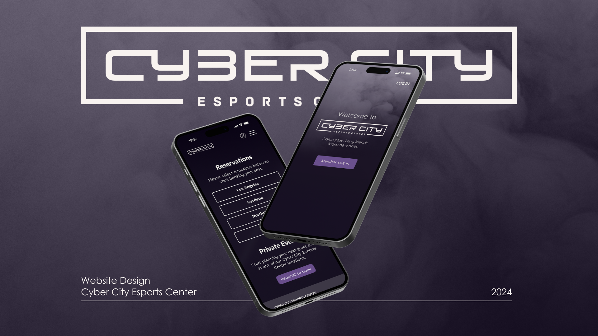
Web Design
2024
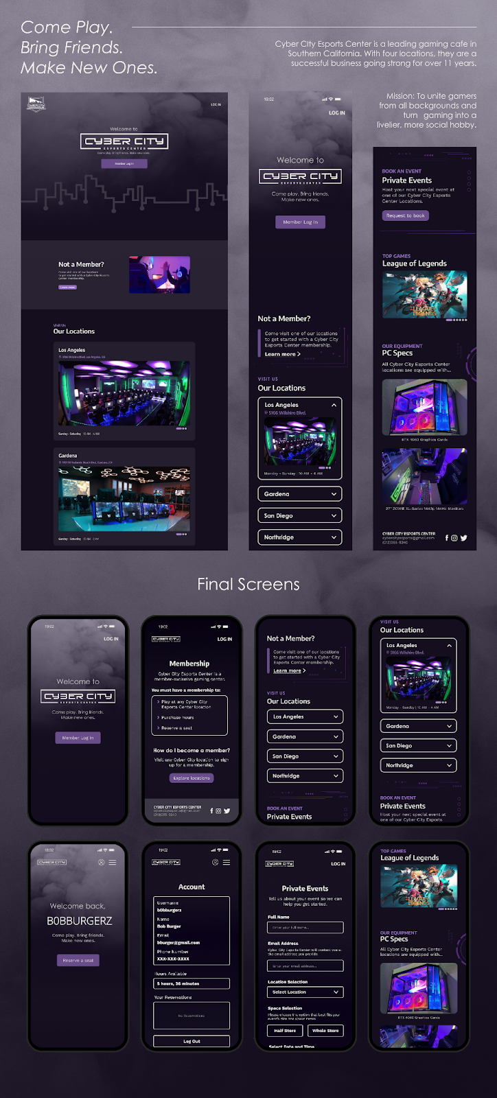
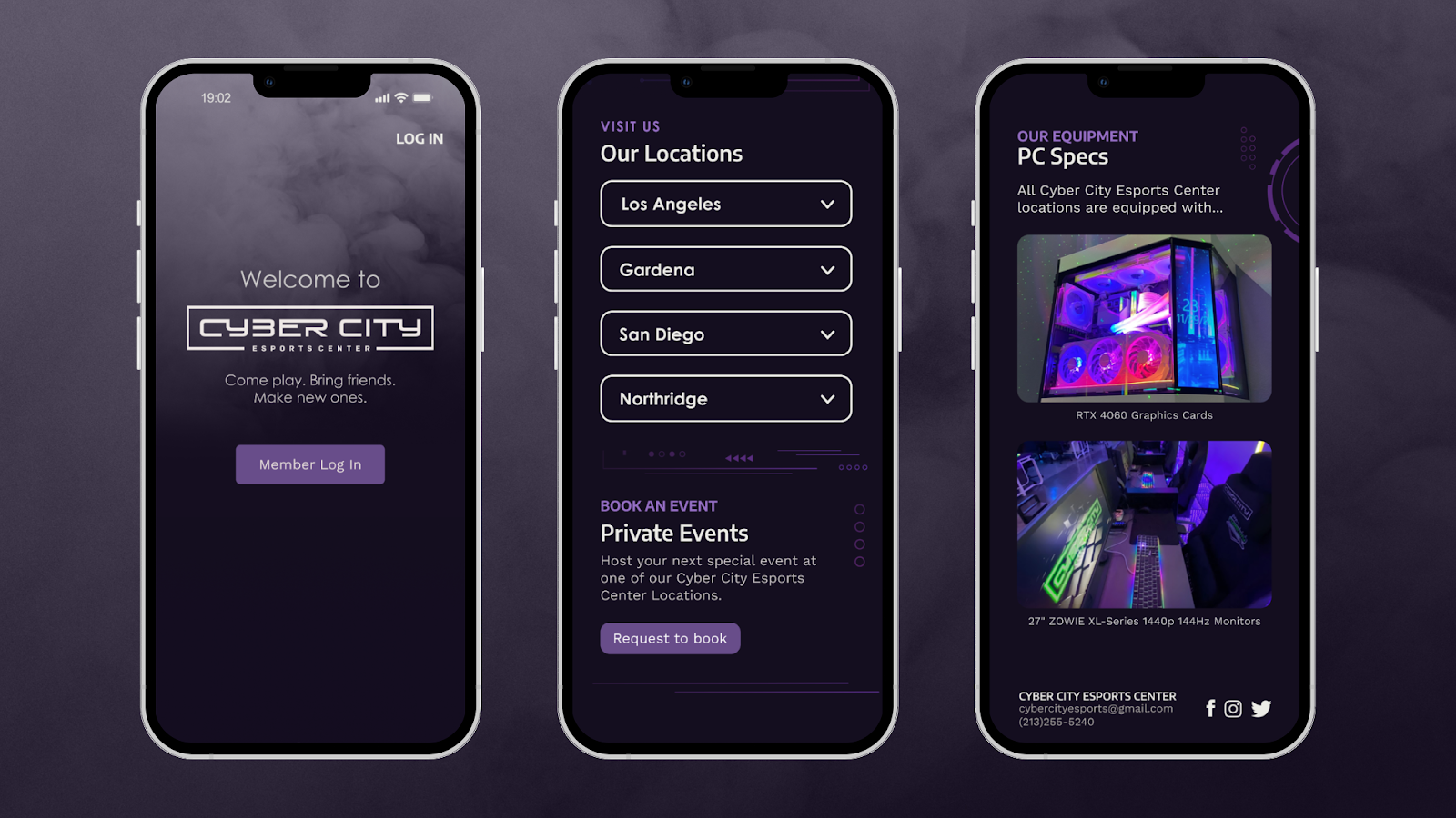
Come Play. Bring Friends. Make New Ones.
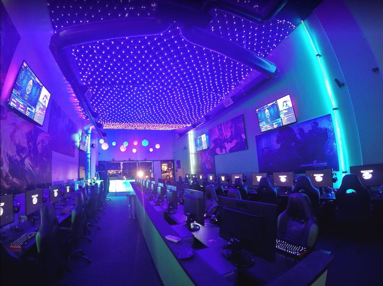
Cyber City Esports Center is a leading destination for PC gamers in Southern California, offering a haven for PC gamers of all ages across its four locations in Los Angeles, Gardena, Northridge, and San Diego. With 11 years of dedicated service, Cyber City has stayed in business by providing top-tier gaming experiences. Their mission is to unite gamers from all backgrounds and turn gaming into a livelier, more social hobby.
As a final project for UCSD’s Cogs 187B course, we designed a website for this local grassroots esports cafe with the intention of improving customer relations and visits.
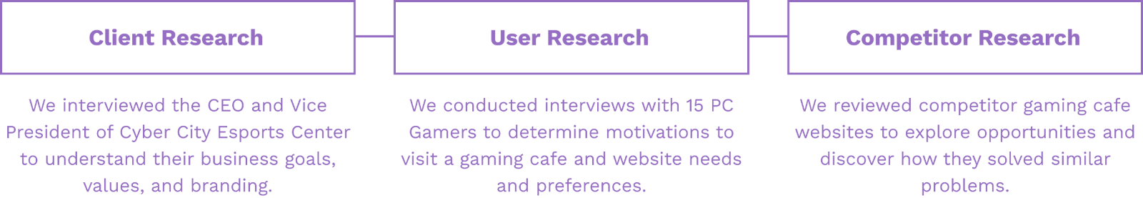
We conducted a variety of research in order to discover Cyber City Esports Center’s business needs, analyze user expectations and preferences, and understand the context of gaming cafe related websites. This research helped us determine what features and functionalities we wanted to include in the website, as well as what style choices we would use for the final design.
We set up an interview with our client to better understand the branding and business goals of Cyber City Esports Center. In a meeting with the CEO, we learned about Cyber City’s background, values, and target audience.
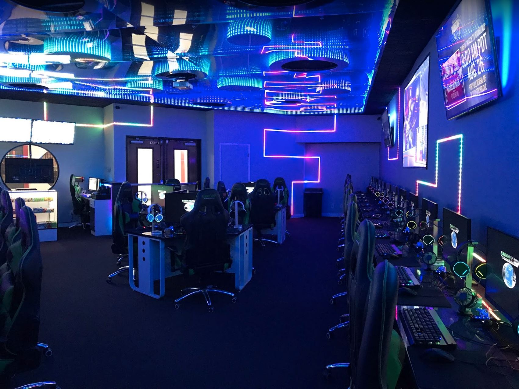
In a follow-up meeting with the Vice President, we visited the San Diego location. Visiting allowed us to get more of a feel for the space, what type of experience that users receive, and what goes on in the day-to-day of the cafe. Overall, we received useful insights from these meetings, and were able to determine that the ultimate goal of the website was to encourage new users to visit the physical venue as well as reward returning customers.
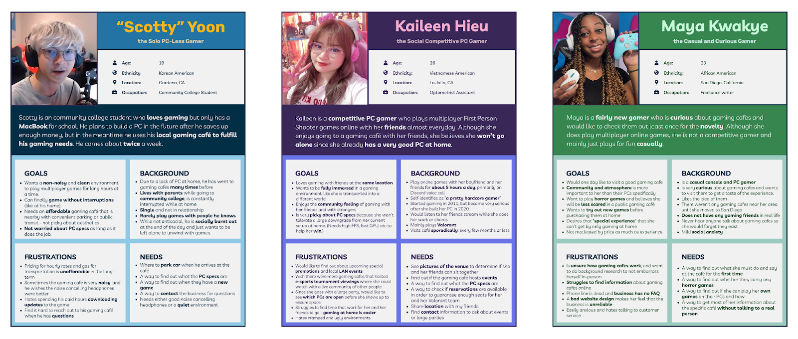
We interviewed 15 PC Gamers to better understand the motivations behind going to a gaming cafe. In order to ensure that we captured a range of potential customers, we intentionally recruited interview participants across two categories: gamers who had been to a gaming café and gamers who had not been to a gaming café. Through our user research, paired with knowledge of our stakeholders' goals, we created three personas for our client’s website. This helped us decide what features we could potentially include.
The interview was composed of questions about motivations to go to a gaming cafe, the priorities of a satisfactory gaming cafe experience, and what users are looking for in a gaming cafe website. We sourced these interviews through a mixture of leveraging personal networks, snowball sampling, and random survey respondents.
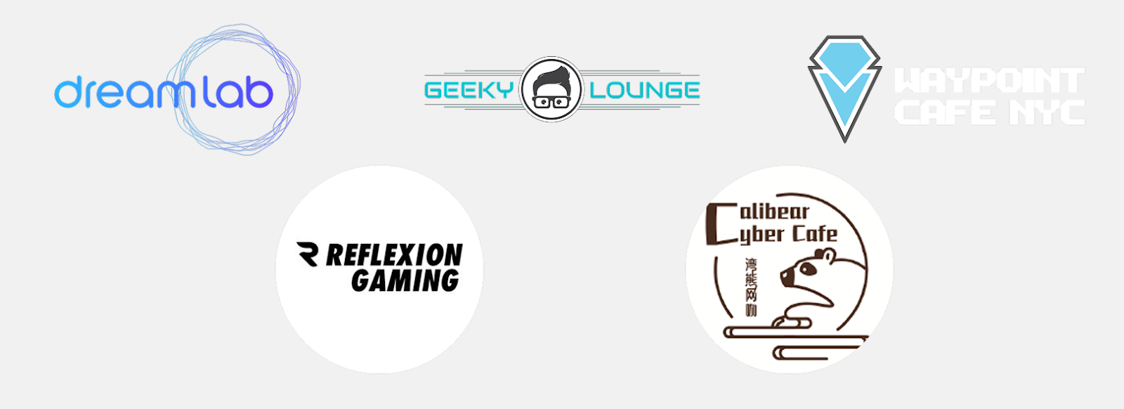
We researched over 20 gaming cafe websites, narrowing it down to the 5 websites we thought were the best and/or most comparable. We then analyzed their branding, functionalities, site architecture, and content to understand how other gaming cafes offer their services.
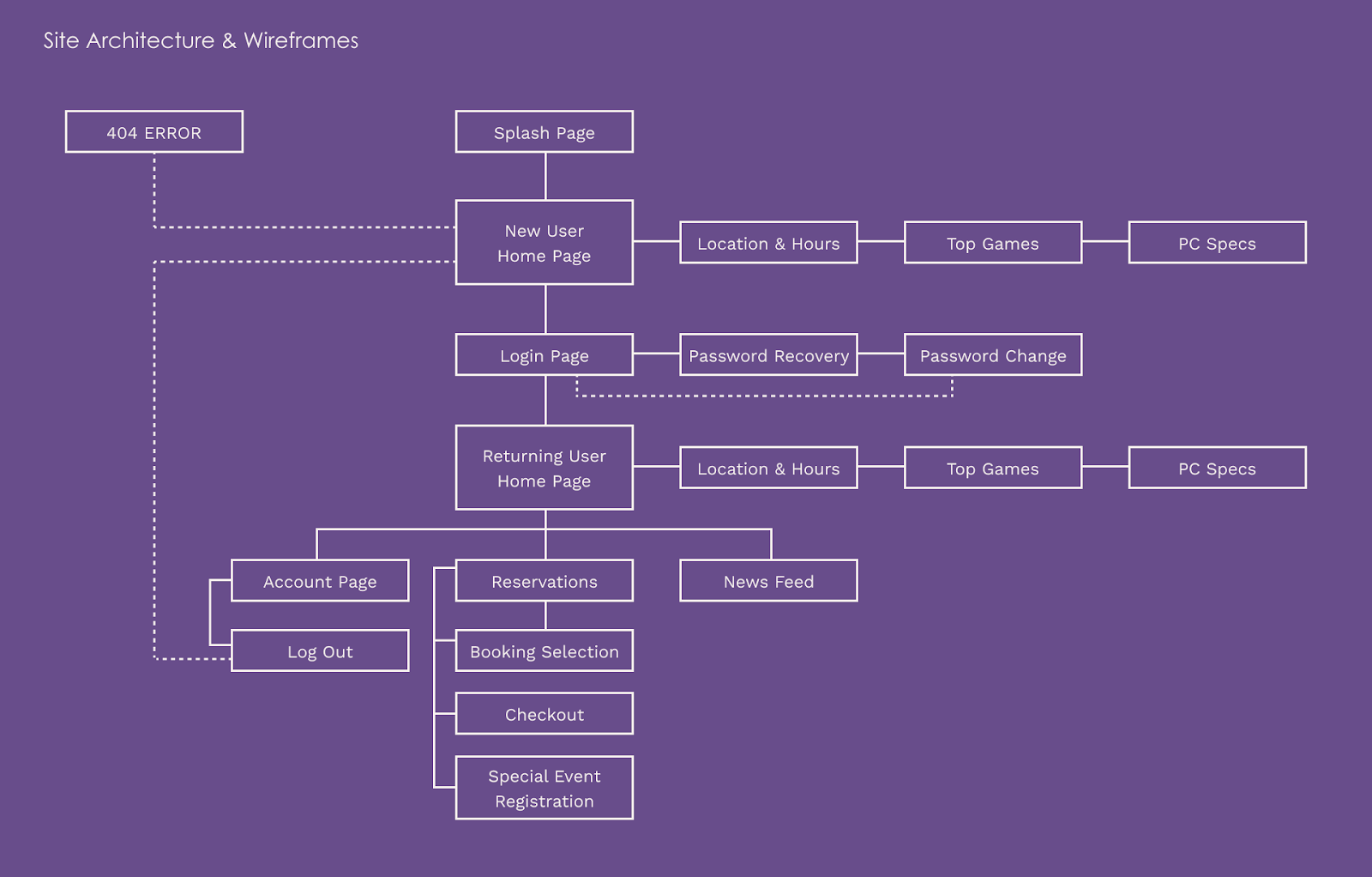
Our next step was creating low fidelity prototypes.
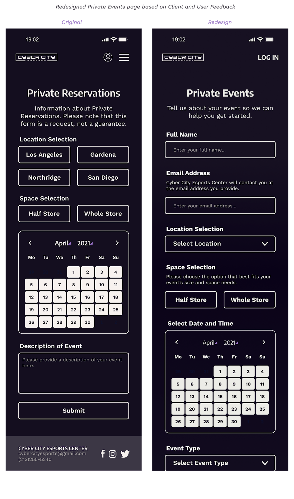
A large problem we faced was the CEO and Vice President repeatedly mentioning the need for the website to follow the hidden, "underground" nature of Cyber City. We had to balance this requirement while still maintaining a baseline online presence that would hopefully draw in new users through foot traffic. At the same time, we wanted to reward returning users, inviting them further into the website, as if they are being let in on a secretive space. We grappled with multiple ideas for a solution, including features such as entering hidden codes, solving locked puzzles, and more. However, we ended up scrapping most of those ideas as it went against the minimalist nature the owners wanted for the website.
Ultimately, we prioritized showing a large member login CTA button on the homepage, with venue information further down on the page. Additional pages, such as reservation access, is hidden behind a login requirement. We hoped that this would encourage new users to be curious about the location and drive home the idea that being a member would provide more in the website.
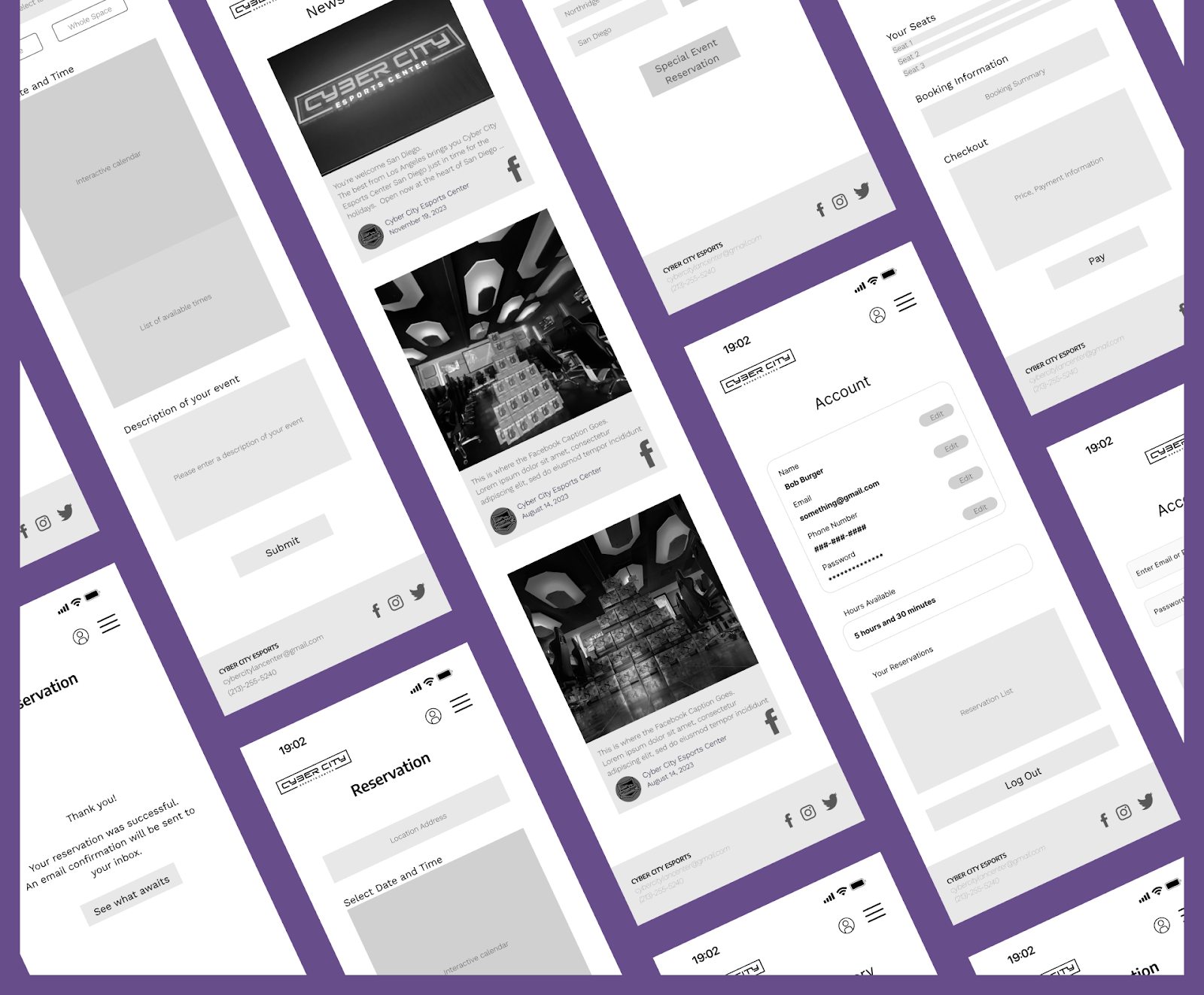
We arranged user testing for our prototypes to gain feedback on what worked and what didn't. A series of tasks was devised to help users walk through our website and determine if flows made sense.
Post-Interview
Overall, users agreed that the website layout looked clean and consistent. Website navigation was easy and intuitive. We took into account various critiques from users and implemented changes based on their feedback, such as improving the wording on specific pages, or adjusting selection processes to increase clarity.
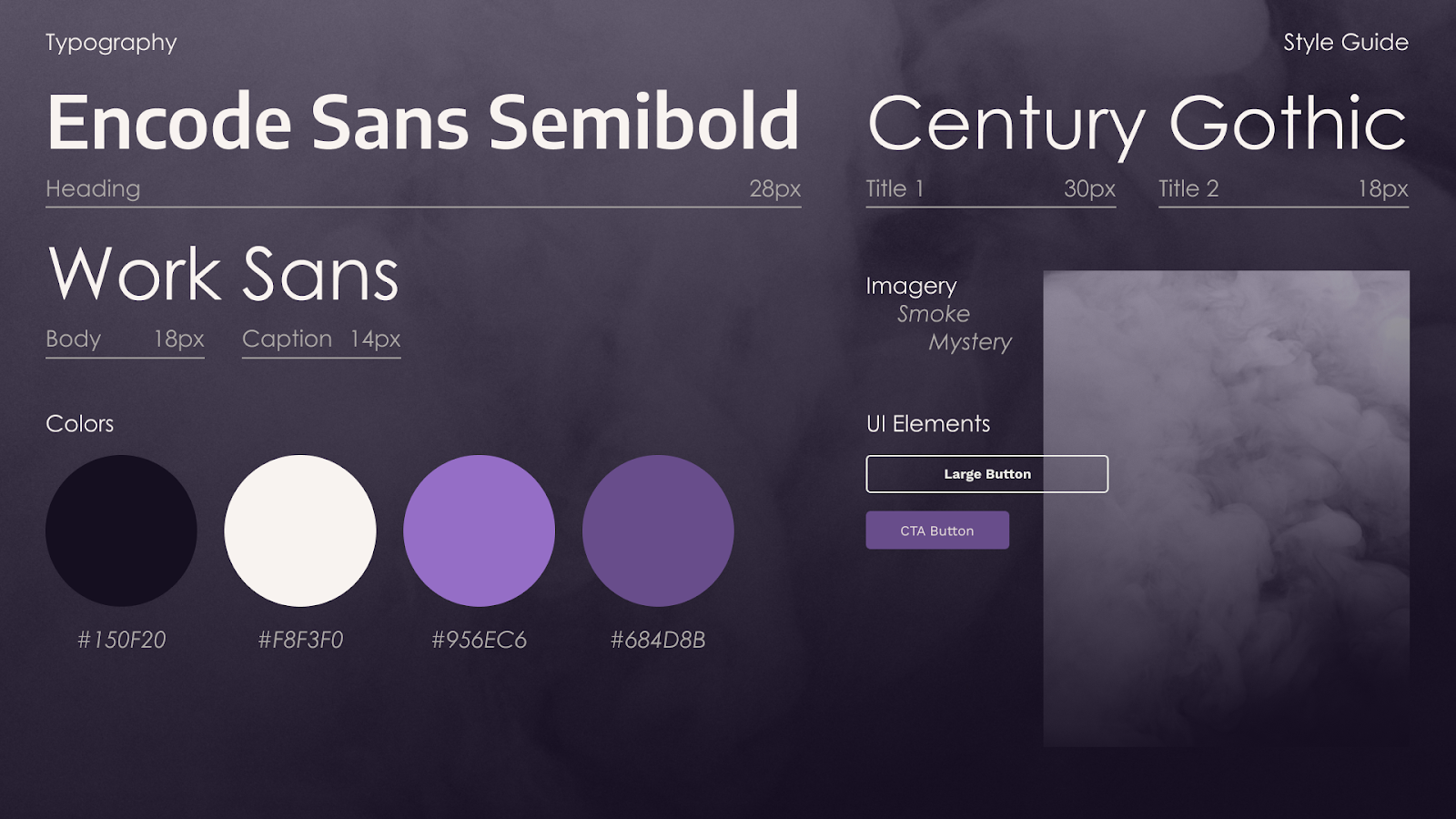
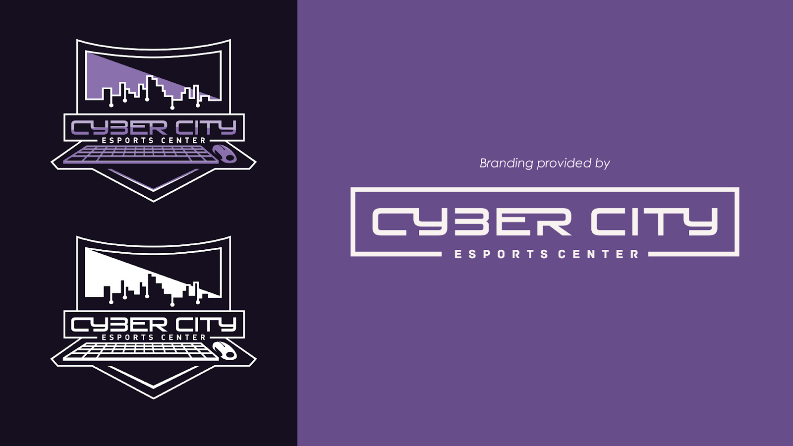
One of the most important things we wanted to nail was the branding for Cyber City. Important keywords were “Mysterious”, “Minimalistic”,”Smokey” while incorporated the Cyber City logos.