Clip Studio Paint Asset Organization
Letting artists have more control over their tools.
UX Design
2025
Clip Studio Paint is a software tool used by illustrators, animators, comic artists, and more worldwide. It is a versatile drawing program used by both professionals and hobbyists alike.
Illustrators need a way to organize and share the assets they use to reference them in future projects and share tools with collaborators, which improves their toolkits and ultimately helps the community as a whole.
In this project, we redesign the Clip Studio Paint peripheral environment and features to better support the workflow of professional freelance illustrators and drawing enthusiasts.
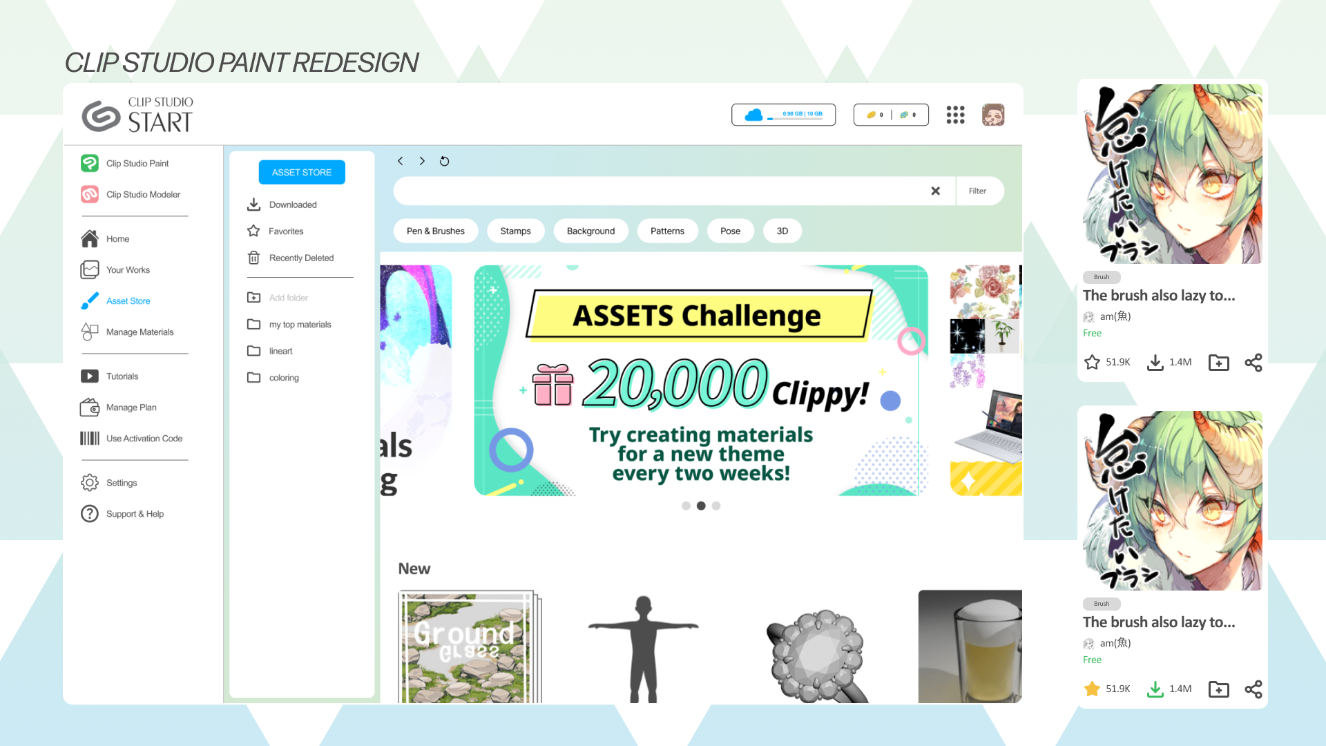
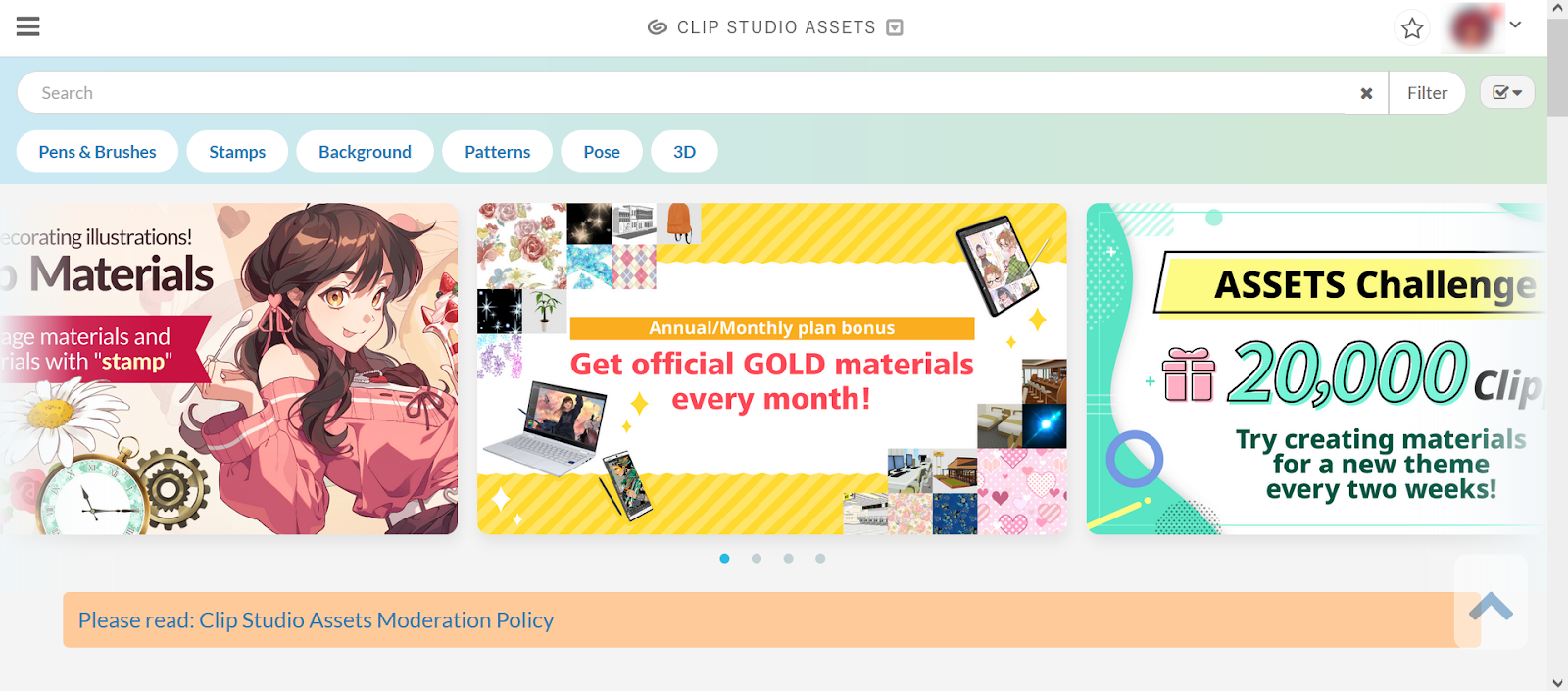
As there are many elements involved within the Clip Studio Paint Environment, please review this section which clarifies these different elements.
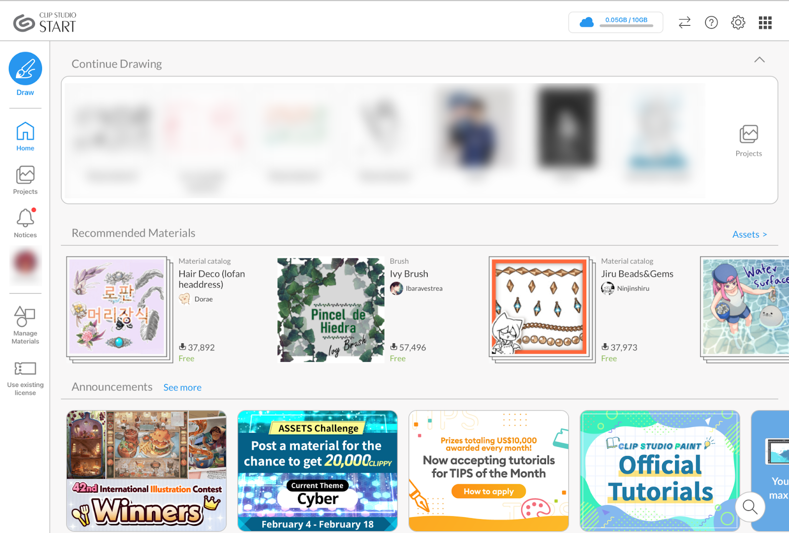
This is the home of the Clip Studio app. Opening Clip Studio allows you to view your recent works, recommended materials, and more. You can access Clip Studio Paint by clicking “Draw”.
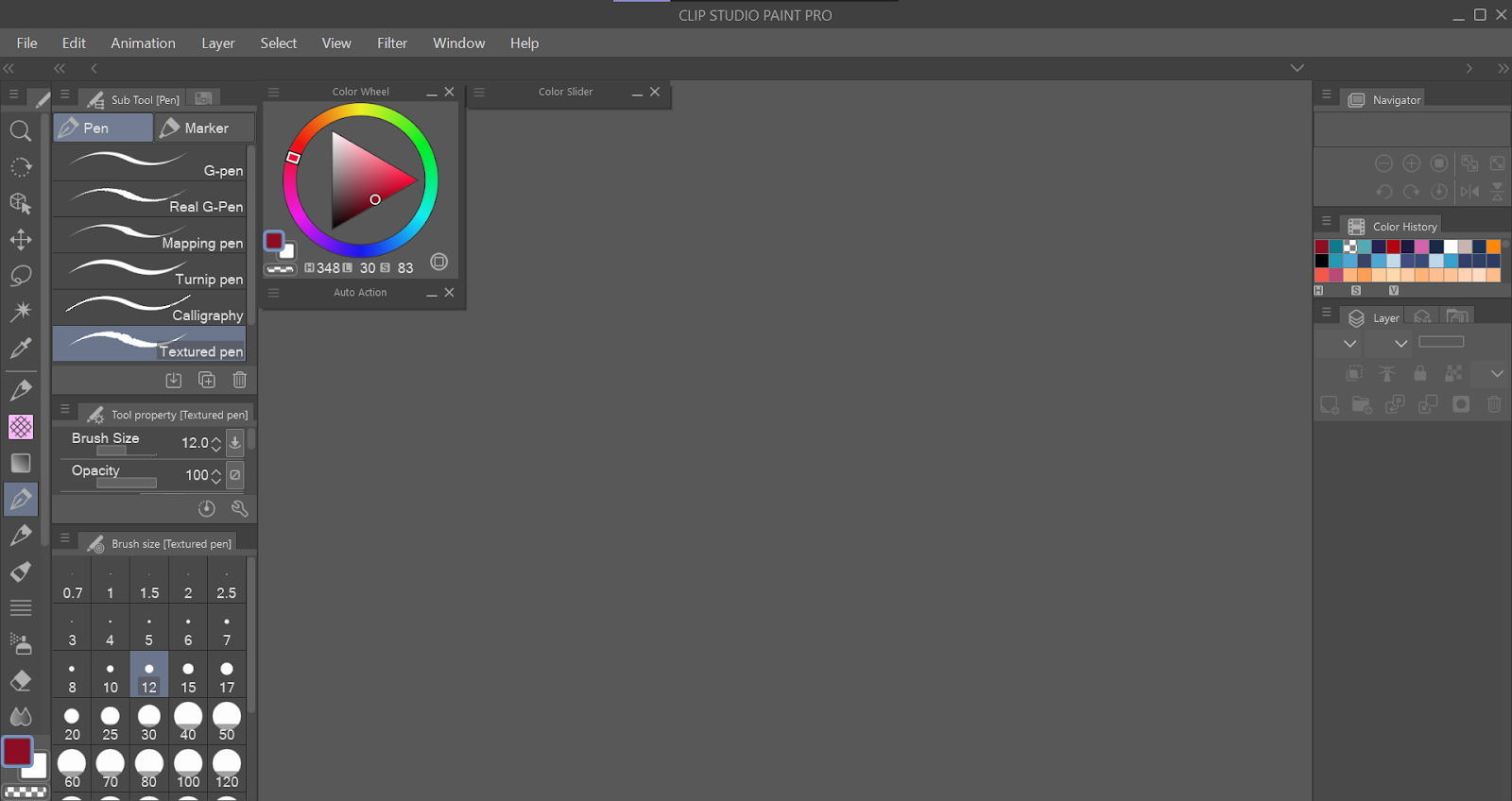
This is the actual drawing software. This is where you are able to digitally draw on the canvas.
This is a website where artists can directly download assets into Clip Studio. Assets are made by artists to share with other artists, and is a large component of why some users choose Clip Studio Paint.
During our initial user research, we reached out to professionals with a focus on those working in creative fields. We wanted to examine what types of workflows exist in spaces that require skills in areas like art making, design, and other creative aspects. While we interviewed stakeholders in various professions, including Software Engineering, Video Game Development, and Freelance Illustration, we decided to move forward in our project by narrowing our focus to the profession of an Artist/Illustrator and their drawing softwares.
We held detailed interviews with our professionals of interest. Interview questions were drafted focusing on the interviewee's work lifestyle, aiming to figure out software tools they use for their work and the challenges they face with them. Our interview consisted of open-ended questions focusing on their general workflow and job responsibility, their enjoyment or frustrations with their current tools, and some real-case walkthroughs. Since this was a semi-structured interview, we inquired about further questions relevant to the topic at hand throughout the process to gain more clarity in the interviewee’s responses. Lastly, if possible, we asked to observe the interviewee go through their workflow or the process of a recent project.
After interviewing six different professionals, we decided to advance with our interviewee who worked in freelance illustration as well as graphic design. These clients ranged from individuals, such as content creators, to larger organizations such as professional esports organizations. Final deliverables usually consist of a mix of illustration and graphic design.
Our interviewee’s main tools are Clip Studio Paint, OBS, and PureRef. Occasionally, they use Figma when they need to focus on something graphic design heavy.
As a freelance illustrator, they described a schedule that is relaxed but requires checking client communications frequently. Oftentimes, since they are contracted, they are the main designer or artist on a project. They enjoy being involved in communities where artists create projects together.
The interviewee uses Clip Studio Paint as their only drawing software. They appreciate:
The main issue present was the lack of organization available in the CSP asset store. The illustrator mentioned that they often browse the store and save assets for future projects. However, it can be difficult to go back later and find these assets because there is no organization available on the website. A user must go through all the multiple pages of their downloads to find it. Our interviewee noted that sometimes they’ll take a guess: “How long ago did I download this?”, and then click on a page that might approximate that time frame. They also run into this issue when trying to share tools with other members of their communities who might want to use the tool for their projects or collaborations.
Clip Studio Paint itself is already a very powerful and cohesive application, and its incredible personalization options mean that users can fix any possible interface issues themselves. However, we noticed issues with the external tools integrated with CSP, such as the asset store and navigation. We are interested in how we can improve the workflow of artists in regards to accessing tools and files more easily so they can get back to the most important part of their work: drawing.
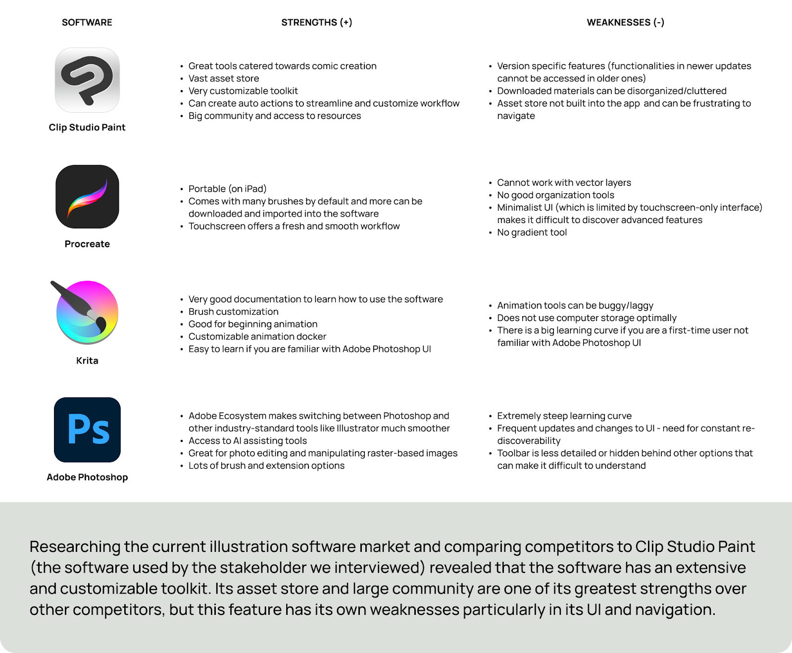
We researched other drawing softwares who were competitors in the same market to discover the various ways the same tools can be presented differently to illustrators.
Our redesign focused on improving these features:
While these are different focuses, they are interconnected in a way, seeing as Clip Studio embeds features from all parts of its environment. Because our problem statement is about allowing artists to share assets more easily, the organization, navigation, and profile aspects of Clip Studio are all important parts to improve.
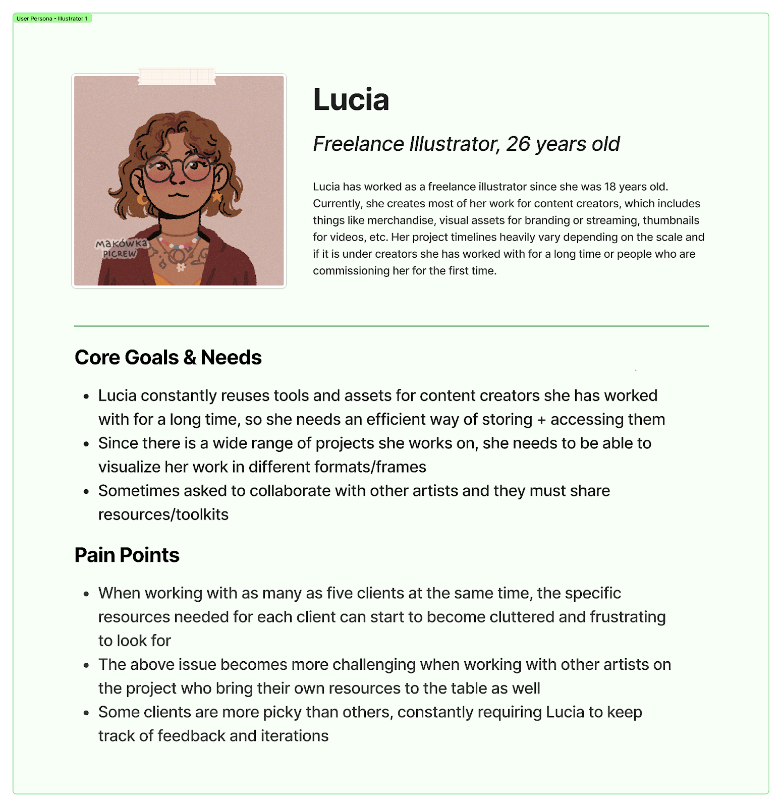
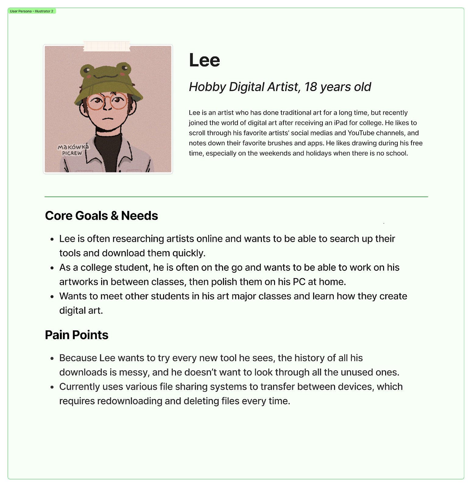
We created personas that followed the goals and needs of our user base to learn what features we might want to implement in the redesign.
We created a few UX flows to solve potential issues that we saw in our stakeholder interview. This included introducing new features and reorganizing navigation. We used our personas to inform the flows based on their wants and needs.
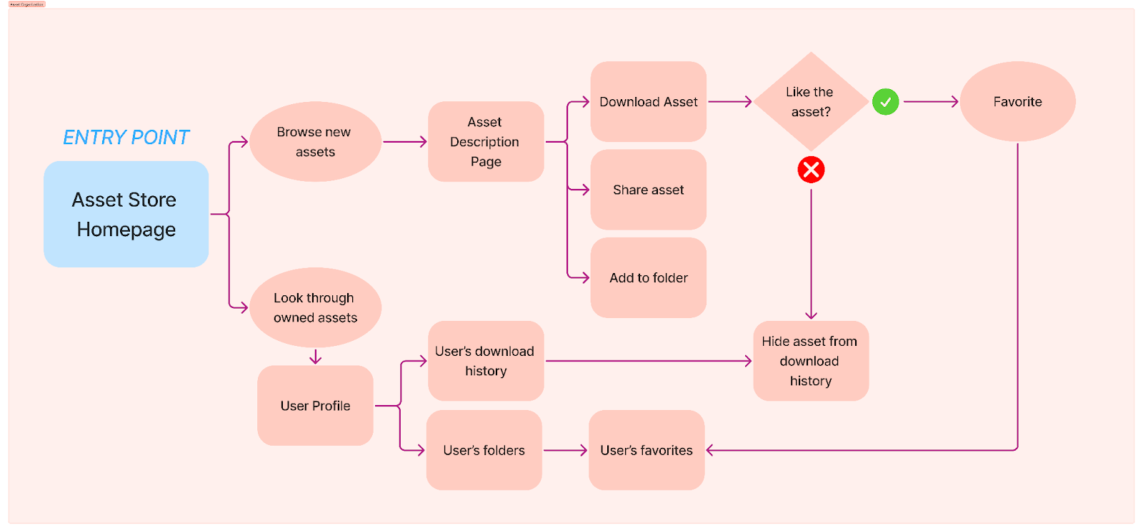
The point of entry for this flow is the CSP Asset Store Homepage due to it being the first page that artists land on when in search of assets, whether they are just browsing or searching for old downloaded assets. This flow is designed for both personas. It is informed by Lucia’s need to organize a plethora of assets throughout her long career as an illustrator, as well as Lee’s need to discover new assets and not clutter his space with unused downloads.
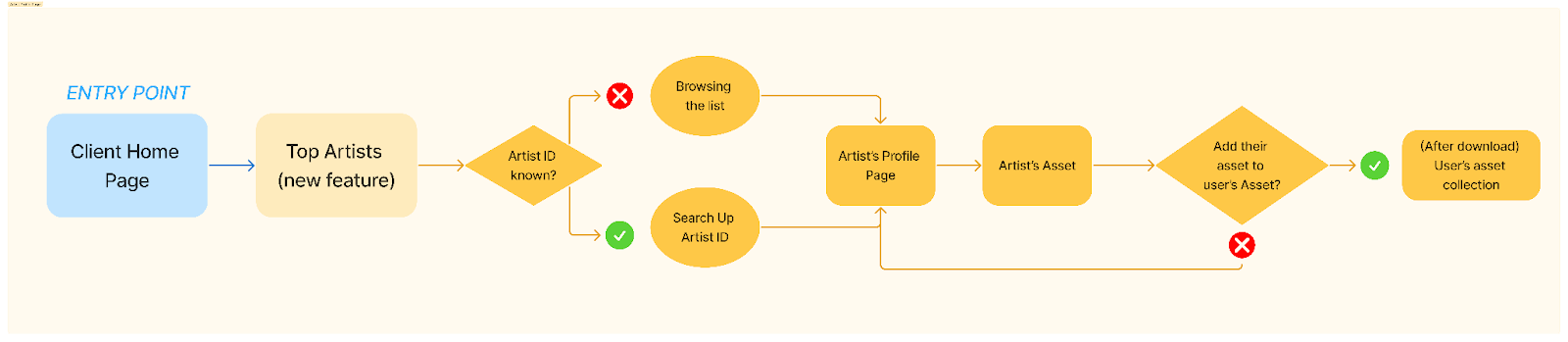
The point of entry here is from the Client Homepage, which showcases Top and Trending sections from their Asset Website. We wanted to implement a new “Top Artist” feature that puts more emphasis on Artist Profiles, which will improve community, connection, and collaboration. Furthermore, artists will now be able to feature the assets they use and enjoy on their page within the current barebones profile page. This feature was made with both Lucia and Lee in mind, to help artists help each other while emphasizing community.
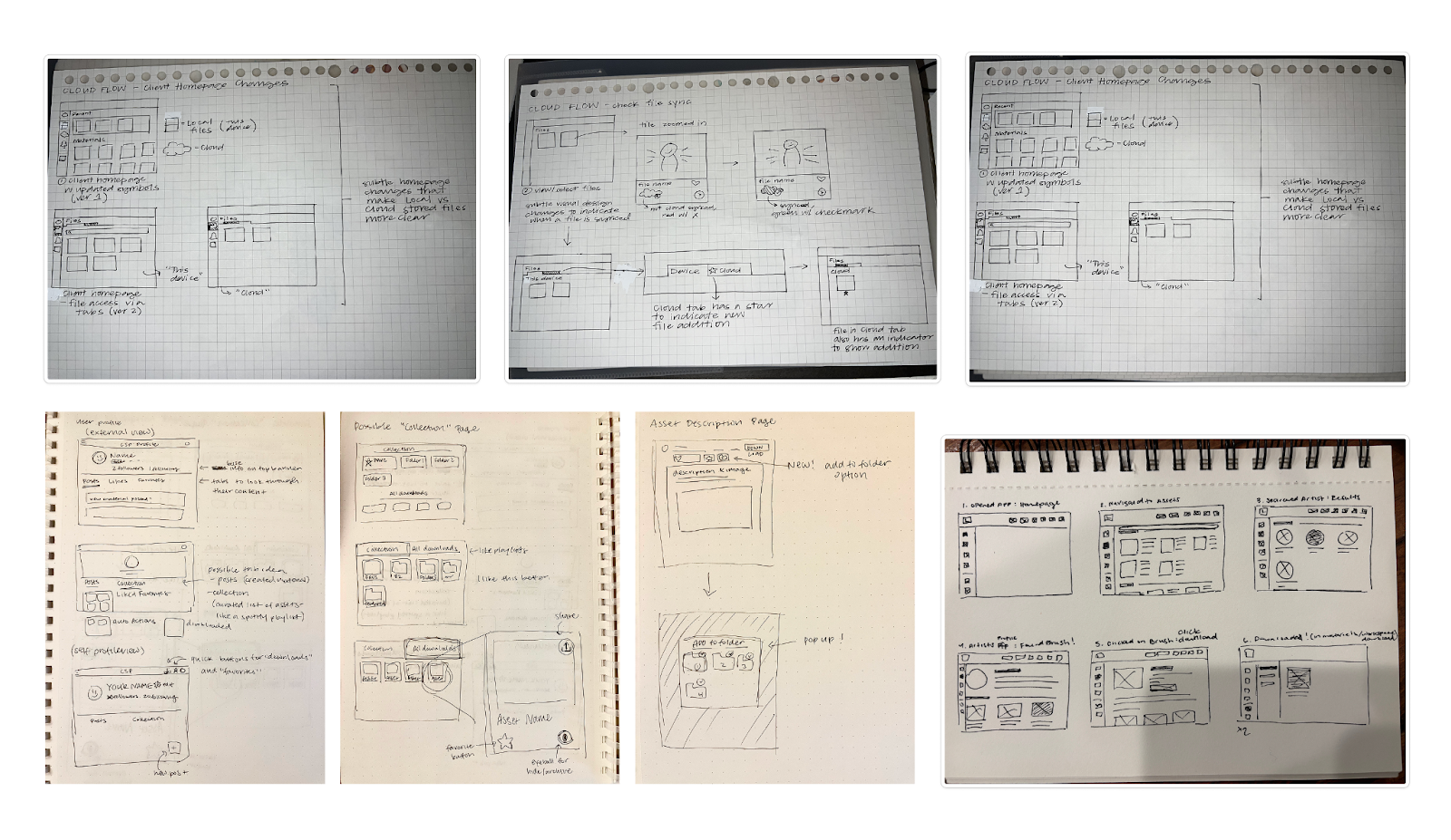
Drawing so many UI sketches helped our team understand what parts of the UX flows we designed might work, and what might not work. For example, in Flow 2, we realized that reaching the downloads page might actually be more difficult if we have so much focus on the profile feature. So, we needed to look back at the webpage to rediscover the existing flow and how we could either keep it or reimplement it in a more efficient way. We also took inspiration from competitors and general UI practices to gain ideas on how to format new features, such as client navigation and artist profiles.
To address the navigation issue, we decided to conduct a cart sorting activity where five participants had to group cards in relatedness and name each category. Each card represents either the features in the navigation bar or subfeatures within their main features. After the participants have completed their task, they answer a few post questions. We recorded all the categories mentioned that all five participants have listed. Participant feedback and the amount of time a category name popped up will help us to consider what main features are important to include in the navigation bars.
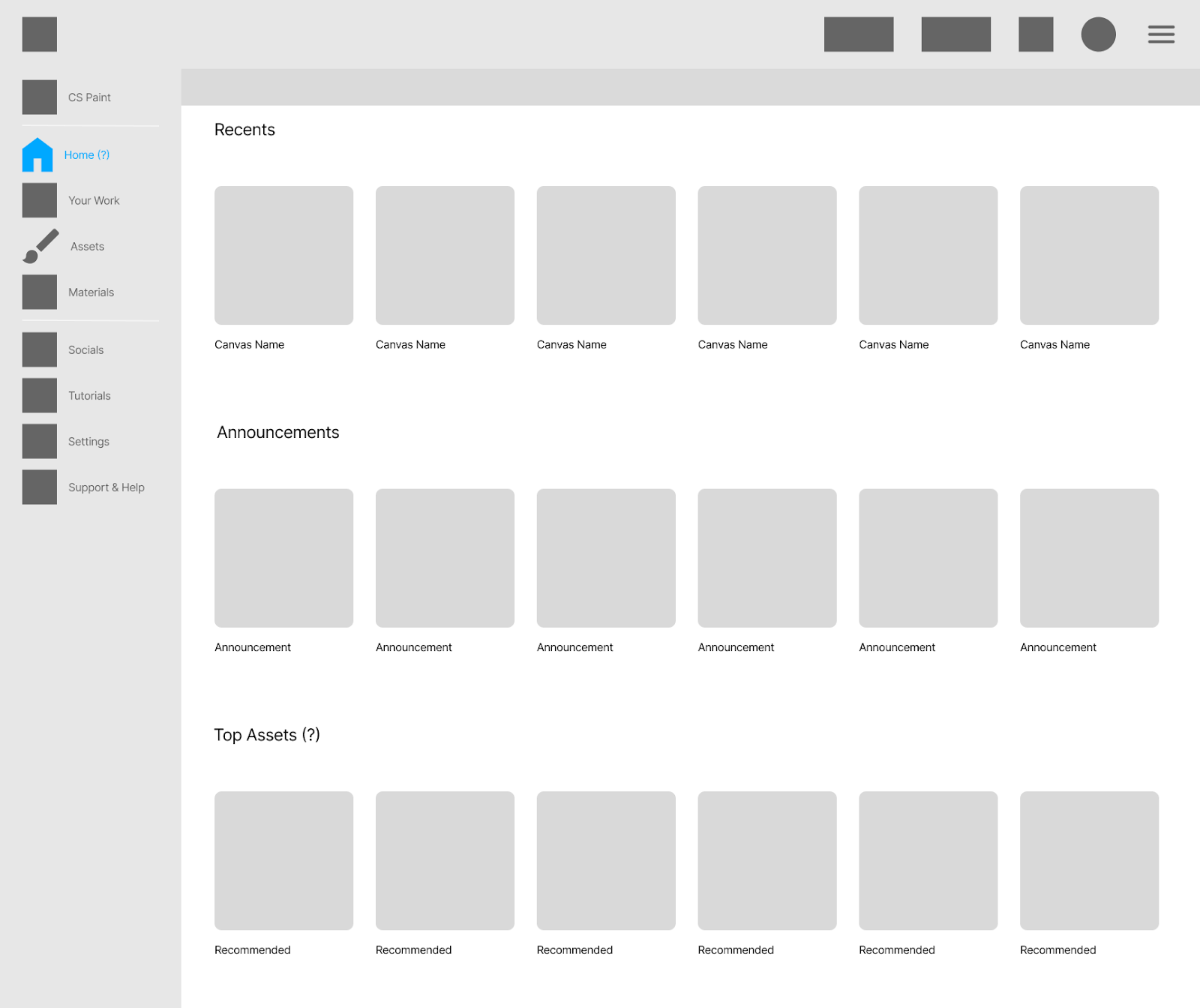
As specified above, we took into consideration the participant's feedback and the category names that were listed and attempted to create a comprehensive hierarchy of features in the navigation bars. This is how we would imagine the first screen would look after the user has loaded into the software.
Homepage
This frame represents what the navigation bar would look like once the user has clicked on Assets. The subcategory is still a work in progress, but it will represent the folders of assets that the artist’s can see, whether they have been downloaded or favorited. It will also include all other folders that the artist has created to organize the set of materials that they decide to add.
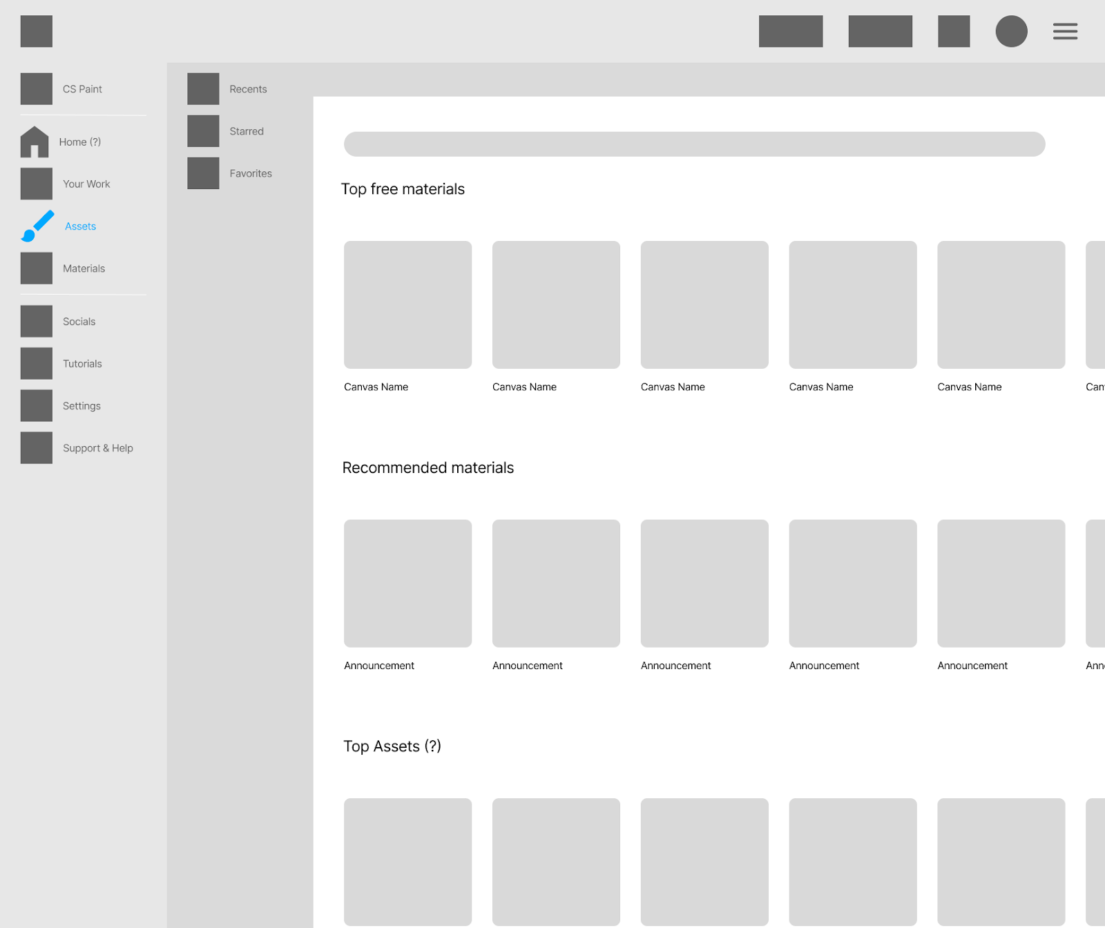
Note: Currently, the assets interface here looks different from our other assets interface since one designer focused on the navigation while the other worked on the full assets page. The navigation bar and assets page will be merged during the mid-fidelity stage.
For Asset Organization, we worked through the Milestone 3 sketches and adjusted many of them when we realized some of the pages didn’t make sense for the flow. For example, we adjusted the Collections/Downloads and how they could be accessed. We didn’t want to increase the number of steps required to reach a page from the existing website, but we still wanted an organizational system that made sense. So, part of our process was to look at how other apps implemented their sorting systems and use that for our own system.
We not only created a way that helps illustrators organize their assets, but as we emphasized in our problem statement, we included various features that encourage sharing and collaboration. This includes icons that users can use to easily copy-paste and share tool links, Content IDs, and even their own personalized collection folders.
Entry Point: Asset Store Homepage
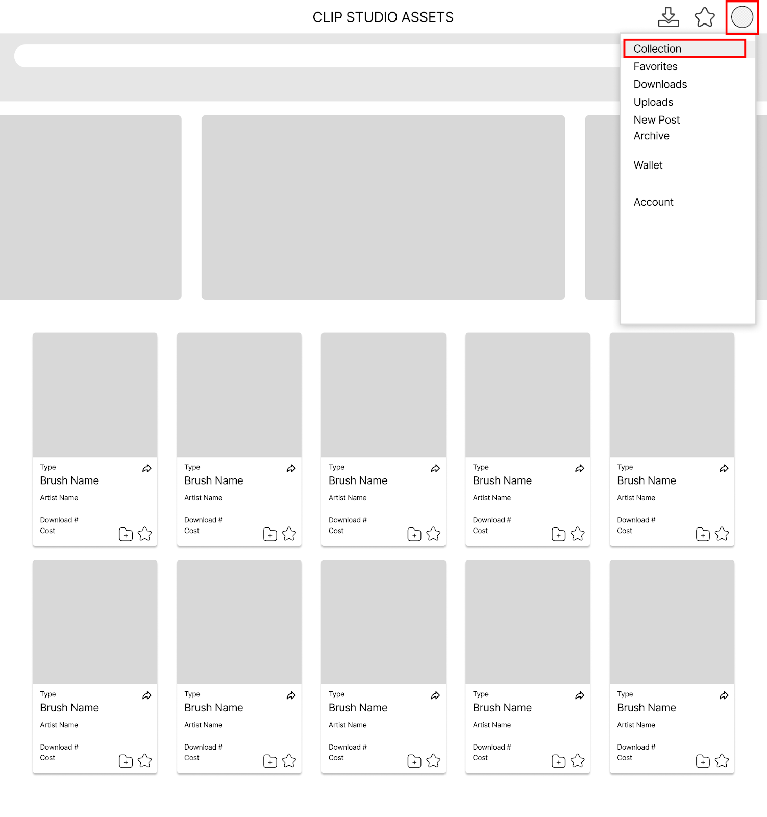
Users can then use the Profile Menu to access their collection. Next to the profile, in addition to the existing shortcut to the Favorites (star), we added a Downloads shortcut, as those are the two prominent pages to see one’s owned assets currently on the website. The asset thumbnails now have extra icons that allow users to share and add to folders. For our purposes, we use this menu to access the next page, the Collection.
When a user selects their profile icon, they get a dropdown of “Collection”, “Favorites,” and “Downloads.” At this current stage, the intention is to see which label users prefer during usability testing when we ask them to seek out assets they already own. We also kept these labels at the top since we assume that while on the assets page, users will likely want to browse through their current asset library while exploring to help with making decisions about downloading new materials.
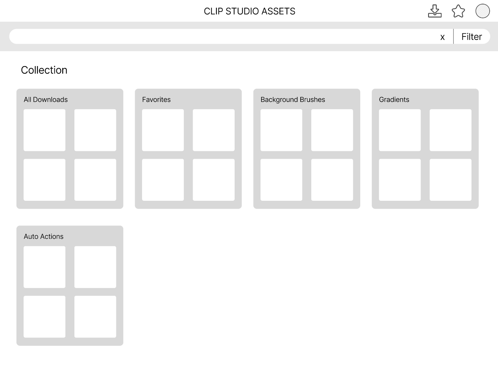
Collection Page
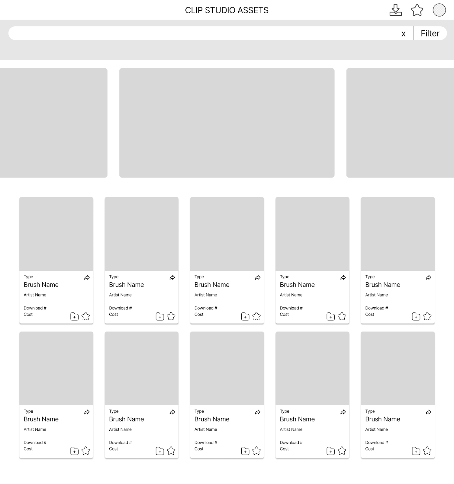
This page holds the user's collection of assets. We mimic the existing layout of the Downloads/Favorites page, just with different features. This was done to follow the standard of the existing website. The “Downloads” and “Favorites” pages exist as a default part of the collection. This idea was inspired by sites like Spotify and Etsy and how they allow users to organize songs and items. Users can arrange their collection into folders how they’d like, and even share them if they wish.
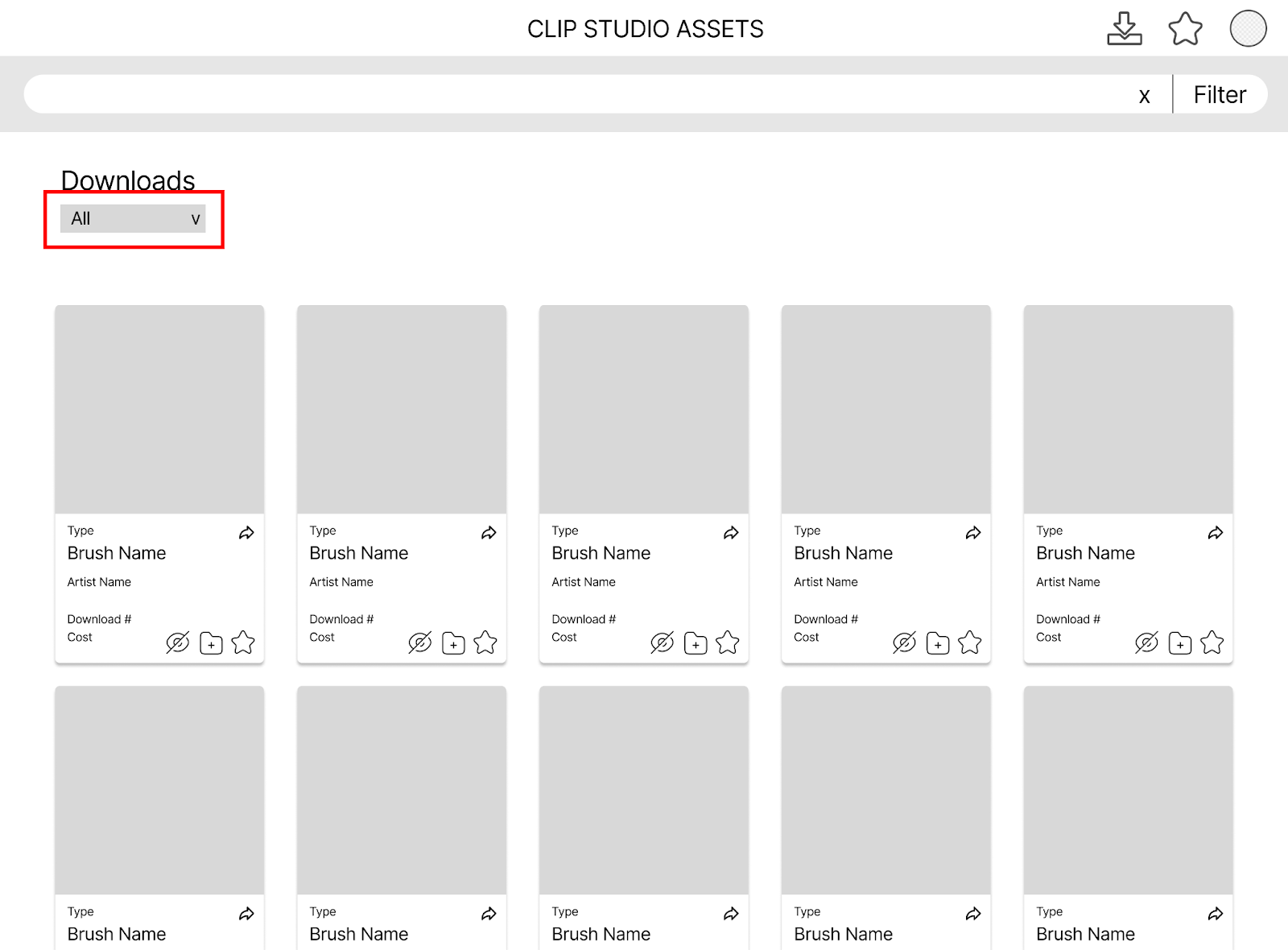
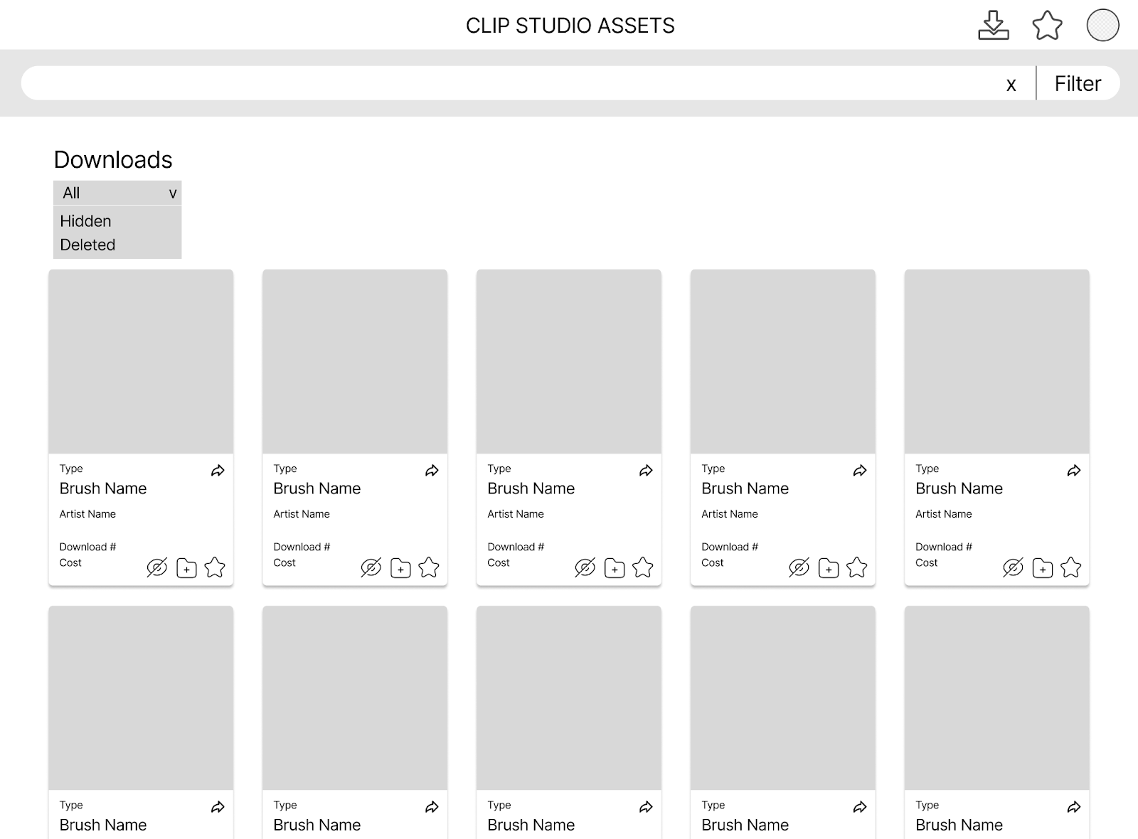
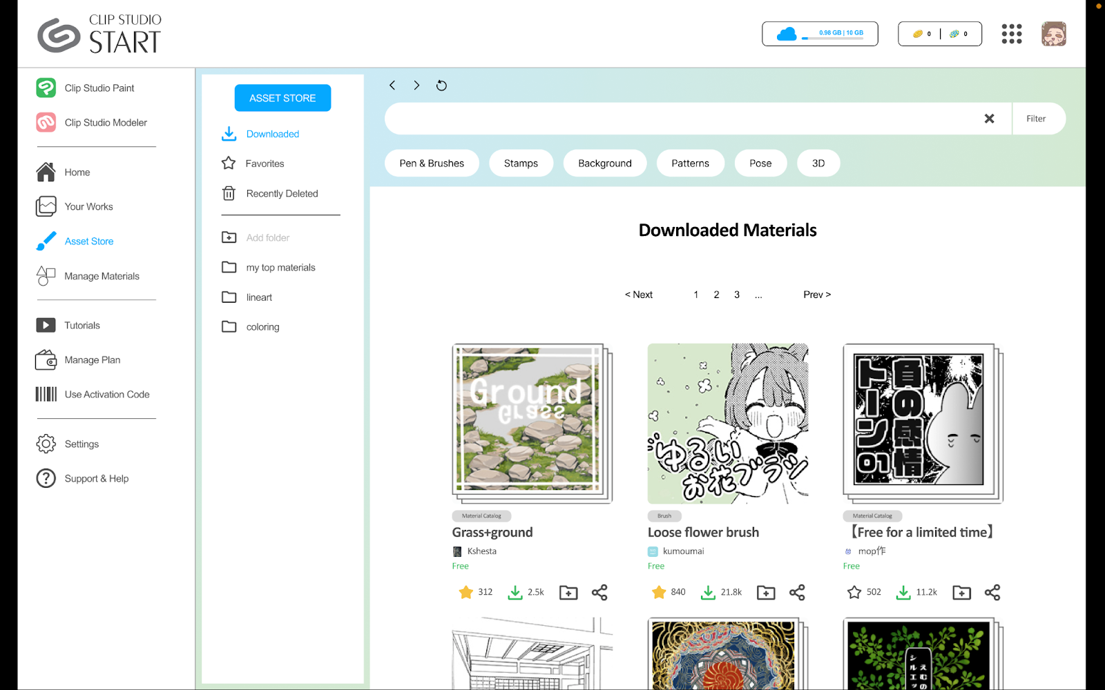
Downloads Page
The Downloads page shows the entire history of the user’s downloads. Note that we included an extra icon on the assets on this page: a “Hide” icon. This is to hide downloads that users might not want to see anymore. Since the downloads page functions as a purchase history (since downloads sometimes cost money), it lists all downloads, even those that users might have just downloaded to try once and disliked. To combat this, we added a section to the existing dropdown section of the page that can show hidden assets, allowing users to keep their downloads organized.
After the user hides certain brushes, they can always retrieve them by going to the filter and choosing the “Hidden” filter. For the deleted icon, it identified the recently deleted items like a deleted folder in emails, though we are going to specify it and maybe change its format into a separate page instead of a filter.
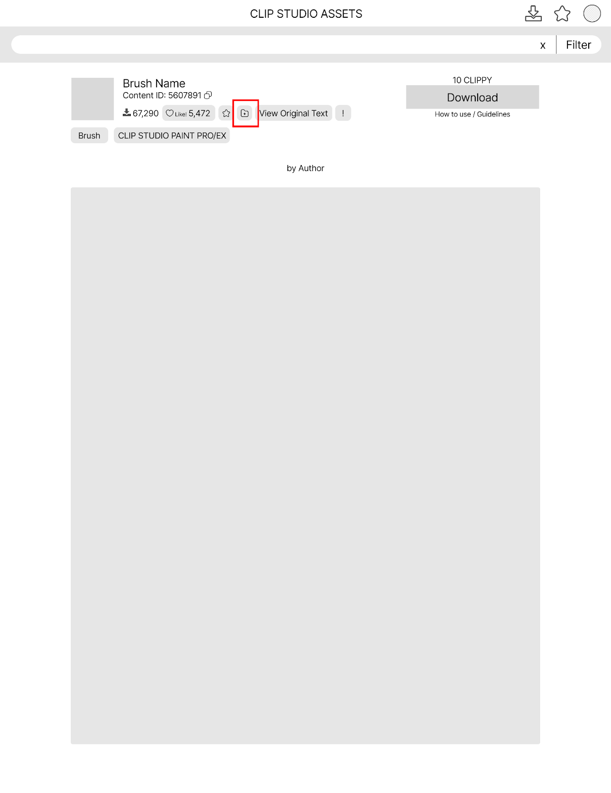
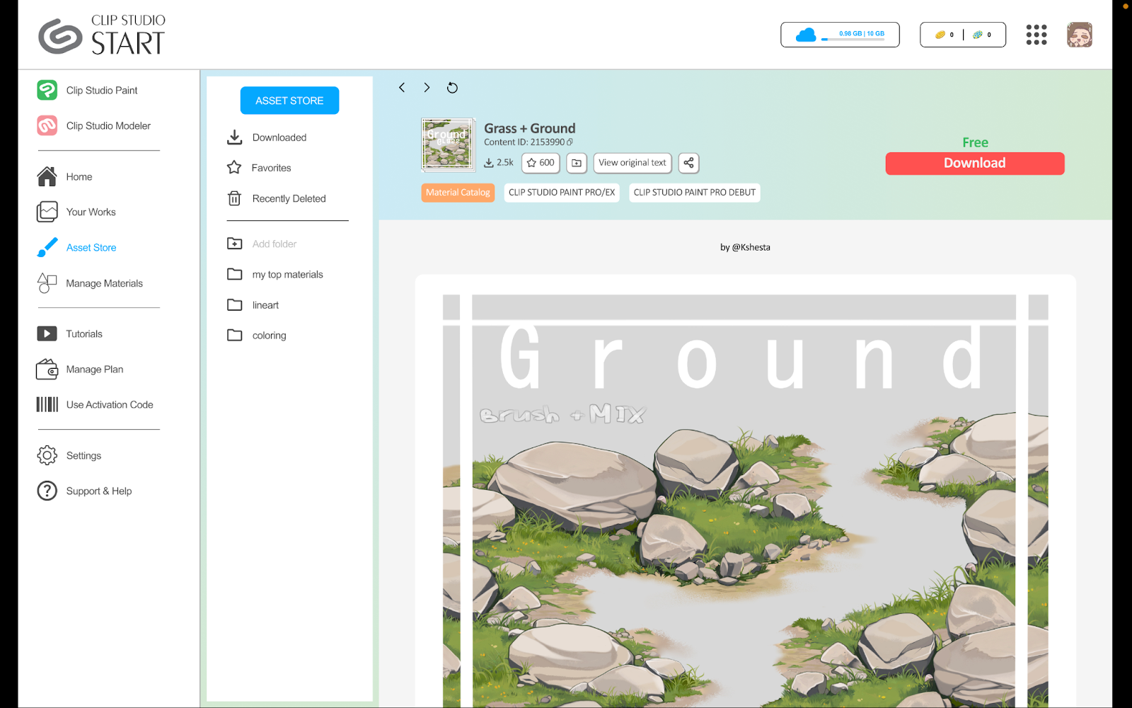
Asset Page
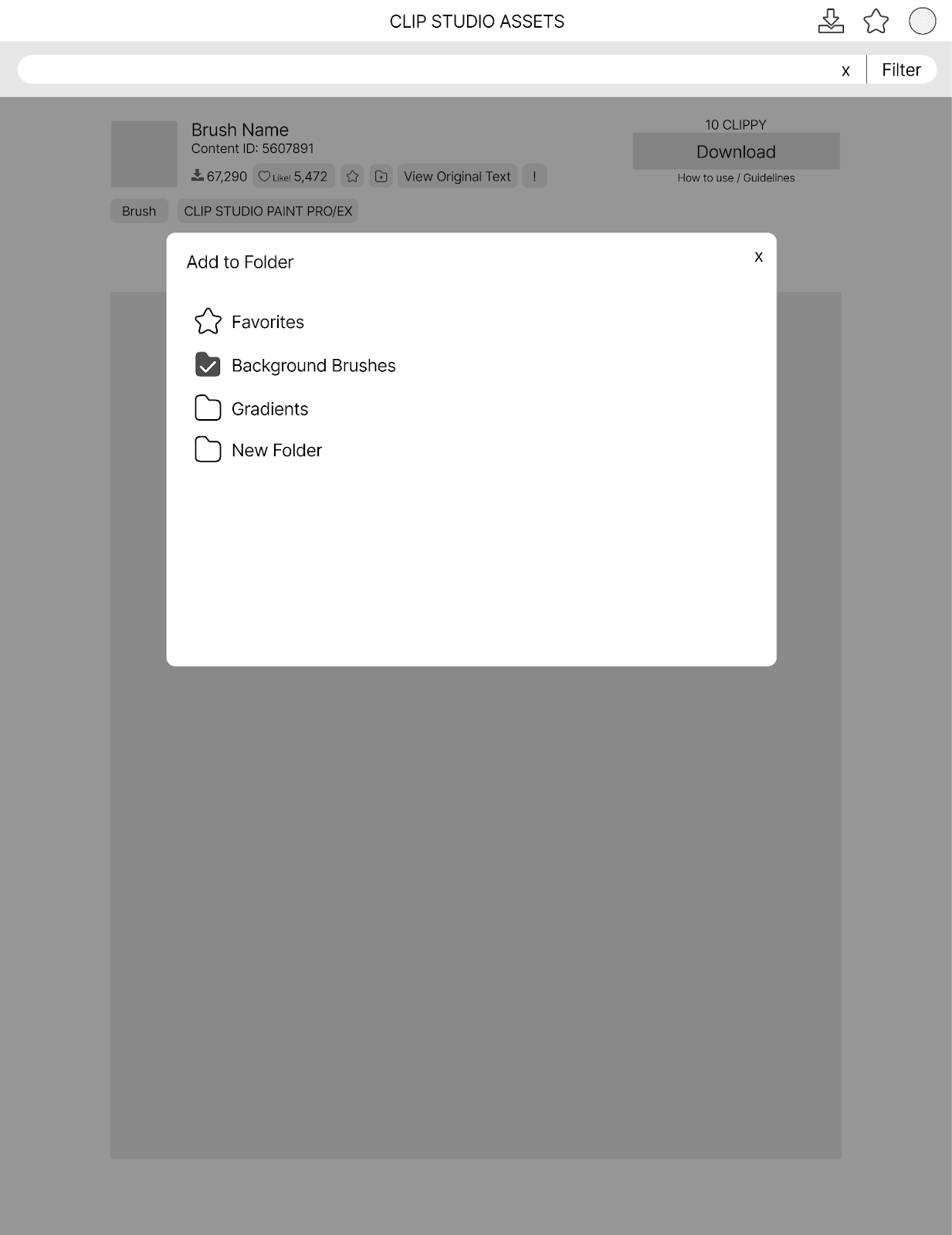
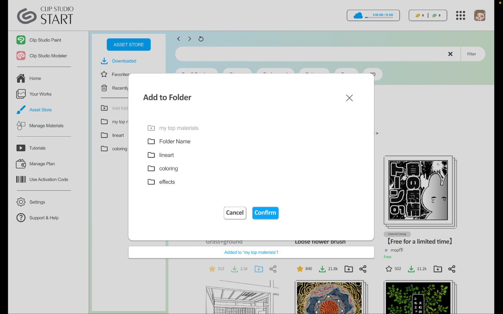
Users can open any asset into its own webpage to download, like, view details, and more. Some other features we included to be in line with the flow, such as an “Add to collection” button (file folder with plus sign icon). The popup that appears when adding to the collection is also in line with the current UI of the website.
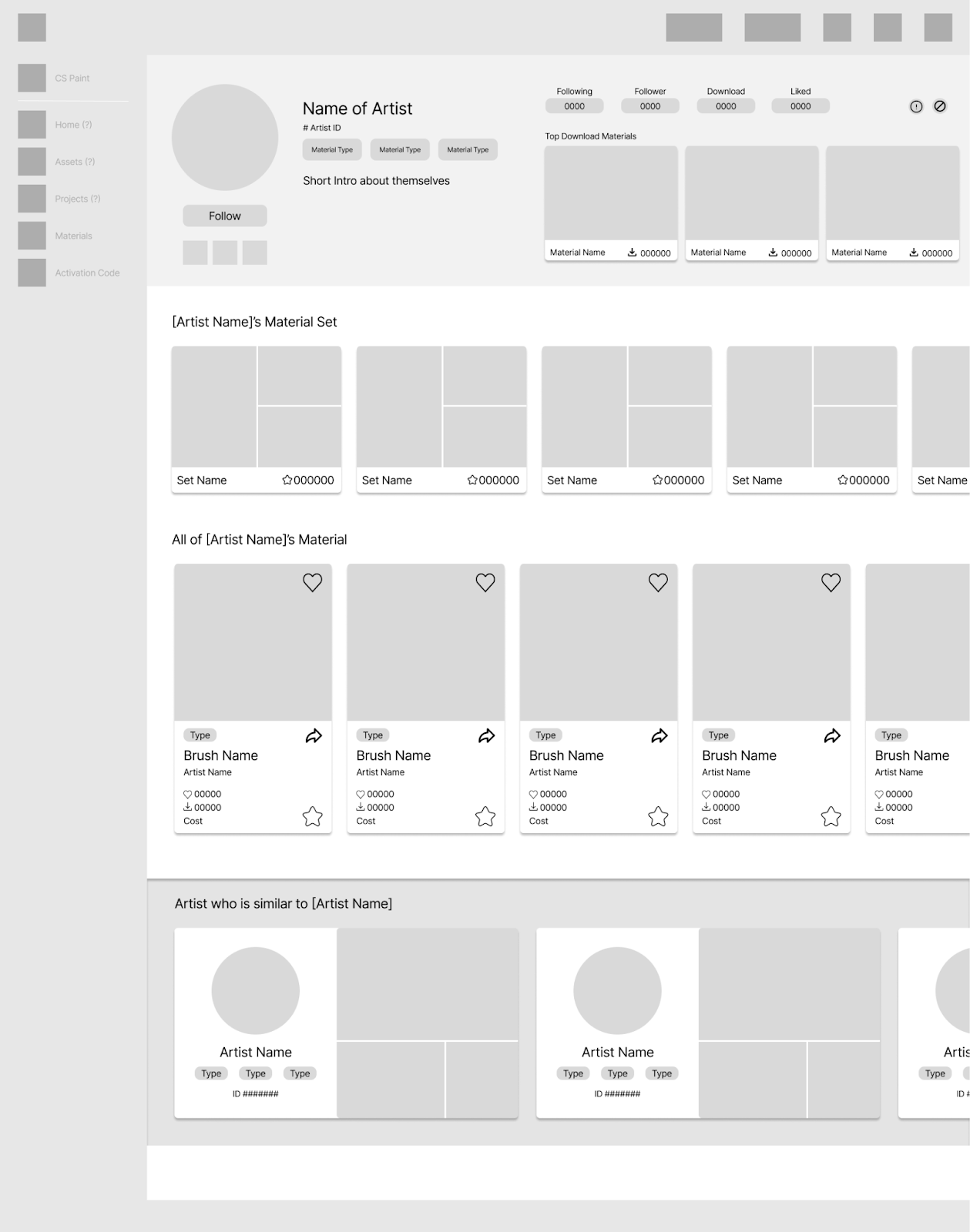
This page is a redesign of the artist profile page which, in its current state, unengaging and piled with repetitive information. We removed the “Post” feature since there is little functionality and no need to implement further social features (CSP is mainly for asset sharing instead of a work display platform, unlike other platforms like Twitter, Tumblr, Pinterest, etc.)
We added a few things. First, we highlighted the material type by sectioning it visually from other information since the material type is the main function of the asset store, while the current UI does not emphasize it enough. Second, we reorganized the banner by putting all of the artist's basic information and added “Top Download Materials” for them to showcase their top materials. Third, we added a “Material set” feature for users to view artists’ certain sets of materials in one place because oftentimes artists use a set of materials for certain types of illustrations and post them when they share their drawings. Fourth, we added materials tags in the bio section, highlighting the material the artist is good at creating. Lastly, we also added a section that recommends similar artists to the artists they are browsing currently.
To gain feedback on our low fidelity prototypes, we conducted user testing sessions with creatives who were confirmed to be experienced Clip Studio Paint users and had involvement in a profession similar to that of an Illustrator. We interviewed our original stakeholders as well as reached out to artists who were asked from in-person local art events and online social media outreach.
Existing CSP Application
Client
Artist Profile
Client
Artist’s Profile
Asset Organization
Client
Artist’s Profile
Asset Organization
Artist’s Profile
Asset Organization
After all the user testing and collecting all of the data, we will be focusing on modifying the following for our mid-fidelity:
During user testing, we found that users liked the clear navigation to the asset store and the new asset organization features. We believe this is because of the new shortcuts that allow ease of access and sorting in our design. They also liked the new version of the “Artist Profile” and saw potential in its improvement.
However, users noted that displaying assets and materials should be prioritized over displaying typical social aspects in profiles. Additionally, some flows in our prototype were difficult to understand, such as what a button or label should do.
Therefore, our next step is to implement corrections to improve the feedback users receive when they take specific actions. We decided to focus on refining the Asset Organization flow for our final high-fidelity prototype. This was due to CSP’s Assets feature being one of its main compelling reasons for use while also being our strongest point of redesign.
This high-fidelity prototype is a result of taking feedback from our user testing and applying it to our existing UX flows from previous milestones. We focused heavily on our first flow that involved Asset Organization, as we received the most positive feedback for that. Our users appreciated changes to the Asset Organization as it was more impactful to their experience as they regularly access resources posted by other CSP users in their projects. The link above links to an interactive prototype, while the case study also walks through each screen below.
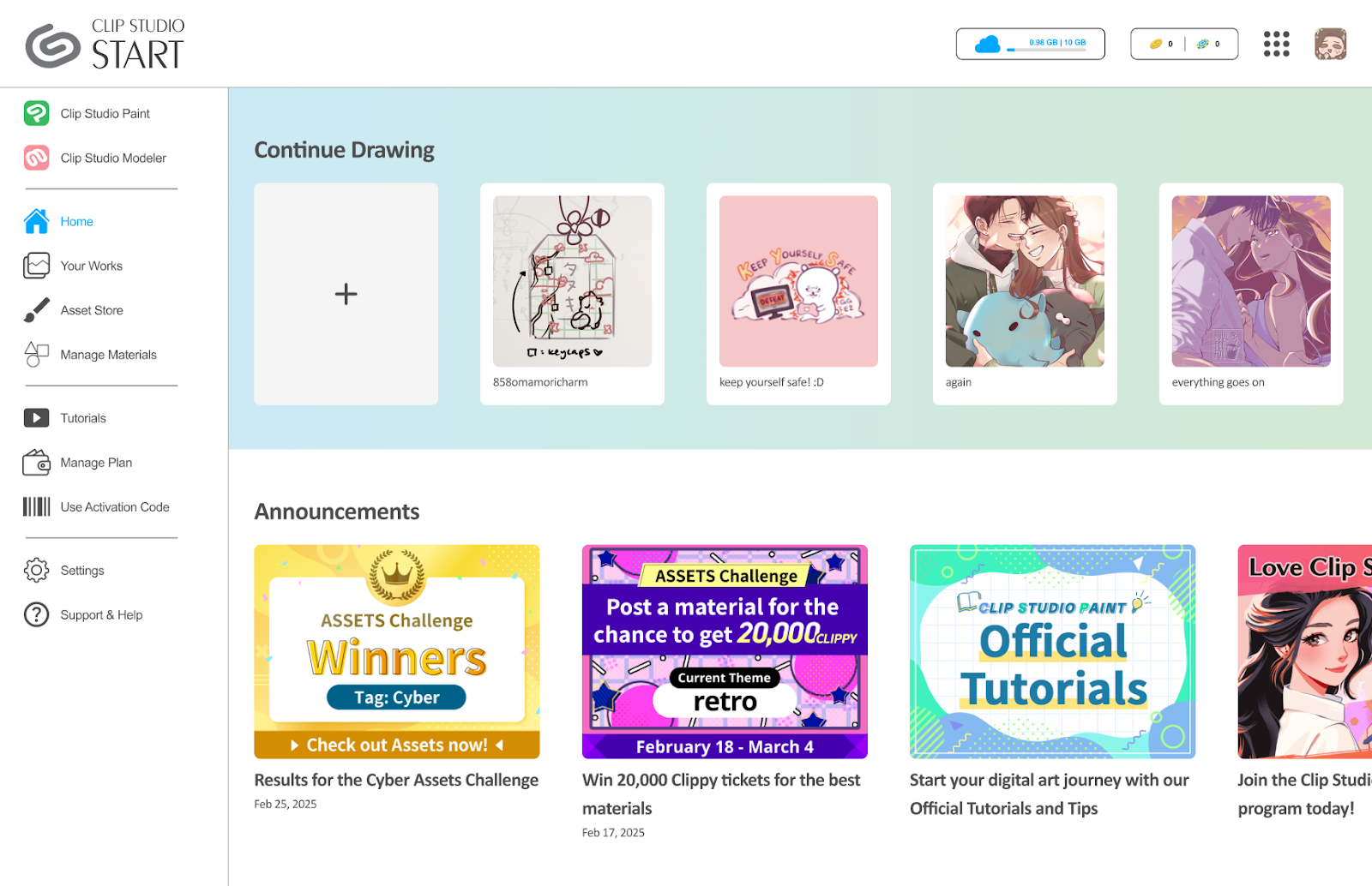
The user flow begins with the general homepage. They can navigate through different sections as they like. Contrary to the current Clip Studio Start portal, the labeling in the side navigation bar is made larger in contrast to the icons, as one of our users during our lo-fi testing stage noted that this change made exploration clearer.
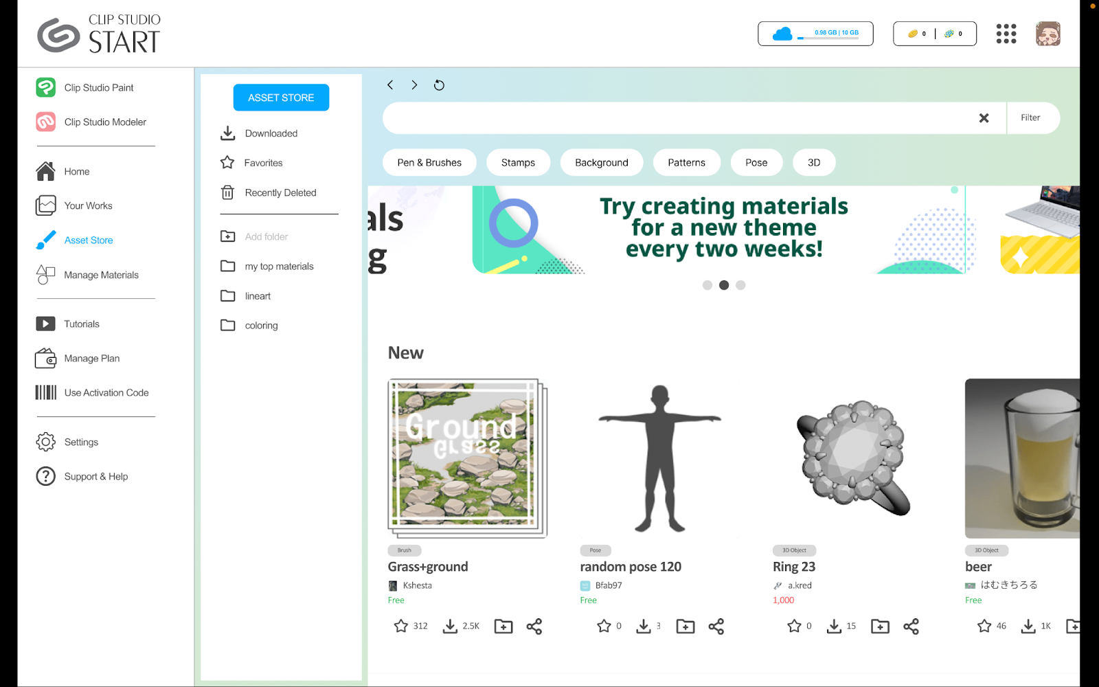
Users noted that being able to access the asset store from within the client was a useful feature that didn’t currently exist. Our prototype implements our user’s feedback for clear feedback when taking action during the flow. One of the main redesign decisions we made was to include a sub-menu navigation bar on the left side of the asset store so that users can quickly navigate to their downloaded assets and organize them, without having to click through their profile as they have to do in the current version of CSP.
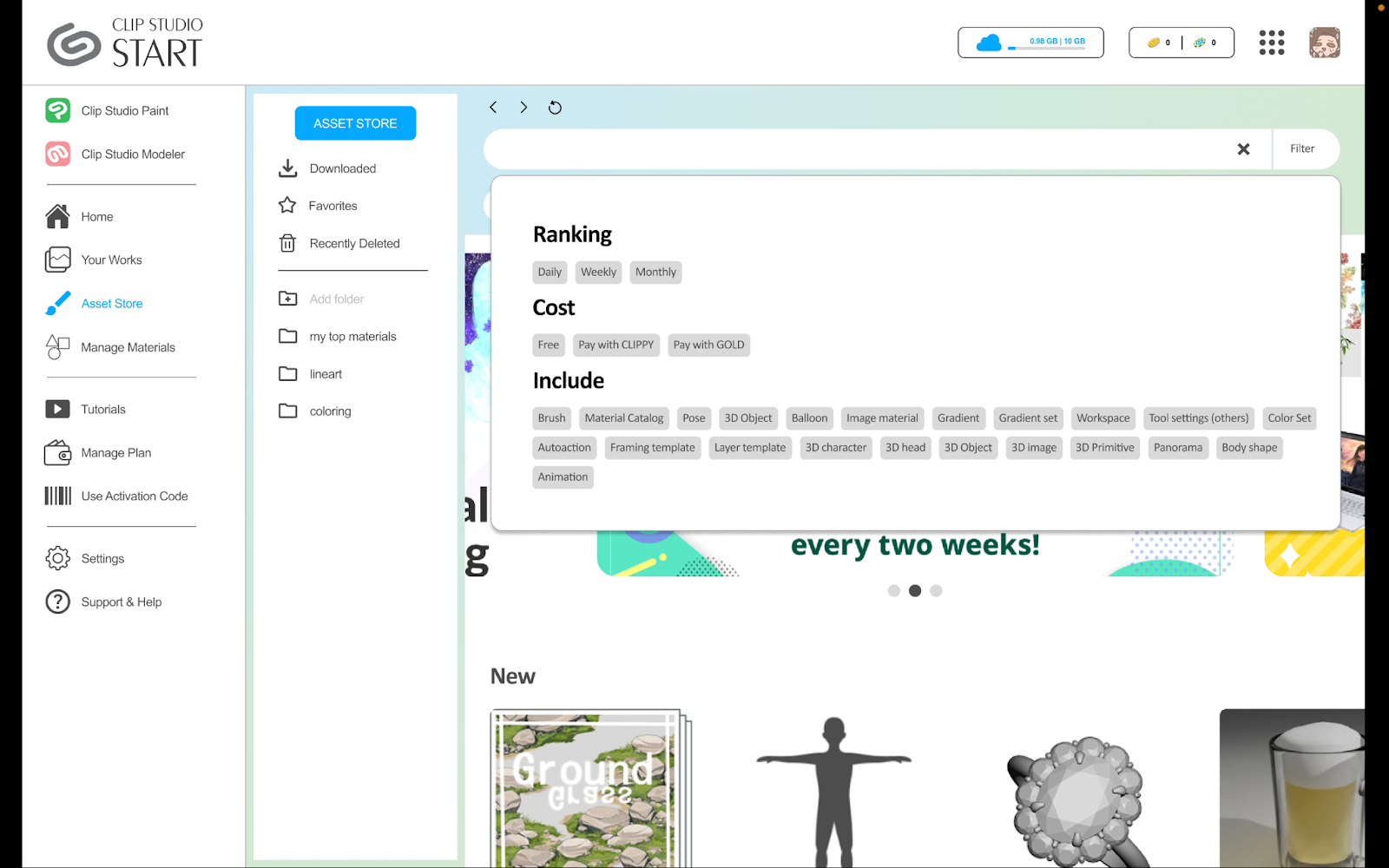
The search bar has “quick filter” buttons so that users can search for the most popular material types amongst CSP users, but the filter button on the search bar expands with further details, just as it does in the current version for the software. However, the filter here has additional details like the popularity ranking of assets according to day/week/month, and a preference for pricing.
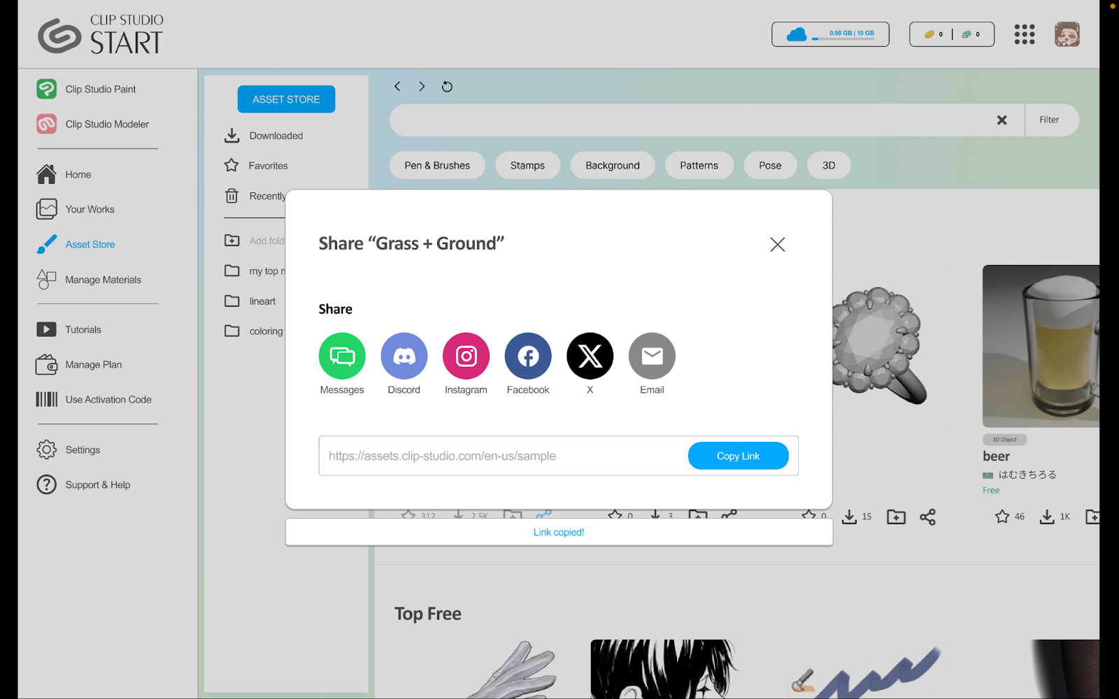
For each of the asset cards, we included 4 quick actions: 1) favorite, 2) download, 3) add to folder, and 4) sharing. These quick actions result in a popup where users can choose what folder to add to when organizing their asset, or how they would like to share an asset. During user testing, users mentioned a pop-up flow would make it much faster to continue exploring the Asset Store. Furthermore, selecting the final action results in a small confirmation popup that can further assure the user of the actions that occurred.
After selecting assets, the user can view them in more detail. From this screen, they can also favorite, share, and organize into folders with ease once they have made the decision to download/purchase an asset.
Once assets are downloaded, users can access them in their downloaded assets, where they can organize them into folders. More pop-ups are used here to allow for quick organizing and sharing.
We made the decision to not further develop the “Artist Profile” page to high-fidelity prototyping due to feedback stating that the social aspect of Artist Profiles was not needed, and to concentrate on improving the Asset Organization experience. However, we do believe that the lo-fi versions of the Artist Profile page should be considered as a feature that exists as part of our ideal redesign, as many users expressed their interest in how it could only be an improvement and not a detriment.
For our final user testing, we had 2 participants explore through the interface. With both the user testing and feedback that we received from our TA and classmates, we conceded the information into a few key points. Along with those key points, our team decided to adjust our screens based on some of the feedback that was given.
Pop-Ups: Users enjoyed the cleanliness and simplicity of the user interface, especially the pop-ups so they would not have to click the brush to access an action.
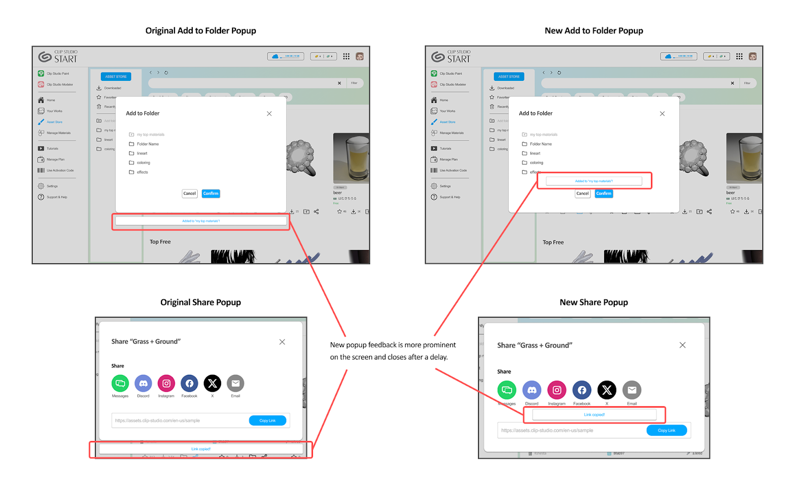
Our team also decided to change the location of the pop-up message so feedback is more clear and prominent to the user.
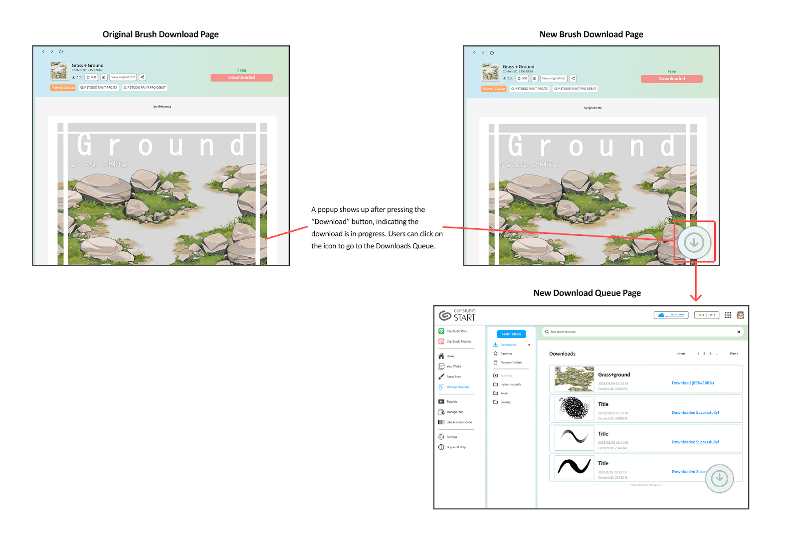
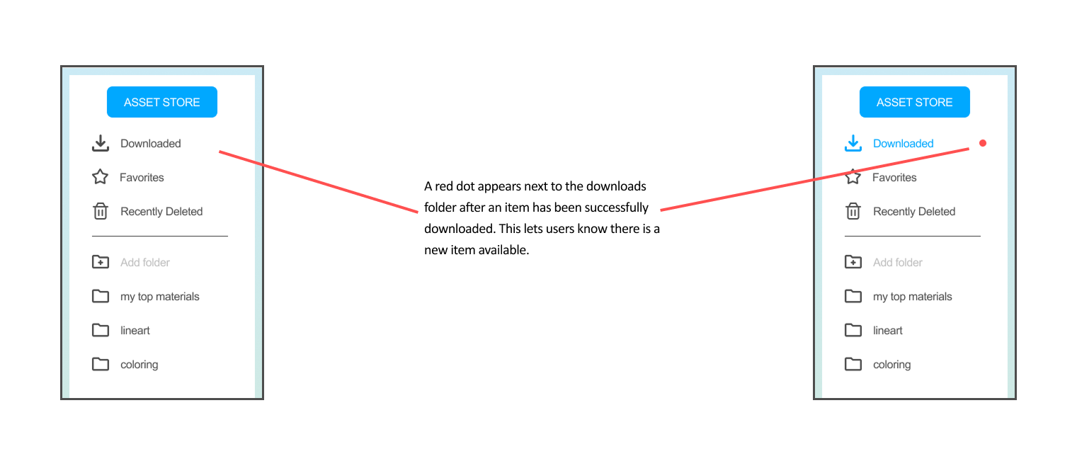
Download Notification: Users appreciate the notification that appears next to download to indicate where the asset is located after downloading it from our alternative screen. Hence, our team decided to add the additional notification feature so that users can comprehensively locate where the asset is being downloaded.
Brush Display Page: A user mentioned that the space underneath the “download” button is huge and could be more aligned with the bottom left tags. However, our team decided to keep the alignment of the button to the middle right of the screen like CSP’s version since it appears more visible and makes the component along with the other information it on the top of the brush page look more full.
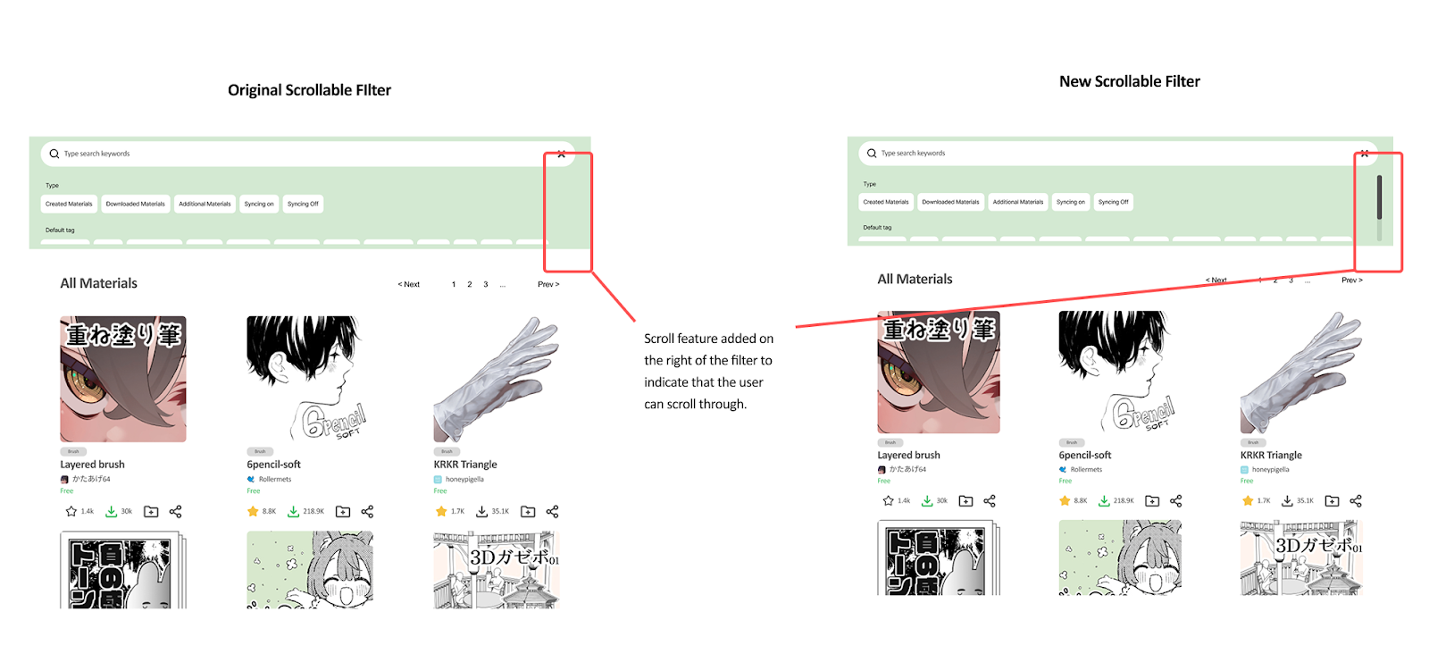
Filters: Users did not have a preference for both our drop-down filters and scrollable filters. One of them claimed that if they wanted more specificity with filters, they would prefer the scrollable option, whereas for a cleaner look and basing the filter solely on types, they would prefer the other. They also mentioned that including a scroll feature on the right of the tags would be helpful so that users can scroll through the tags.
Our final prototype illustrates the experience of opening up the Asset Store and installing a new brush material called “Grass + Ground.” 🌱⛰️
For this project, we redesigned Clip Studio Paint’s asset store to have better organizational features in order to fulfill artists’ needs for a structured system to store their tools. We included new ideas such as folder sorting and quick sharing to the existing Asset Store Page, as well as improvements that explore the possibility of a merge with the Client. We believe that these changes, if implemented, would increase the productivity of artists and illustrators by both making the process of browsing the asset store more enjoyable and reducing the time needed to search for such assets.
Images and asset files used in prototypes are real Clip Studio Paint Assets that can be found below: